The Fiori Dropdown Menu
The Android SDK provides a Material3 based dropdown menu and dropdown menu item that are built using the latest Jetpack Compose libraries. The SDK provides a FioriDropdownMenu and FioriDropdownMenuItem that are made up of several building block composables. Under the hood, it wraps the Material3 DropdownMenu, and DropdownMenuItem, respectively.

Using the Fiori Dropdown Menu
The Dropdown Menu can be used in your app like any Composable function. Each menu item in the dropdown is represented by a FioriMenuItem data class instance. This list will be used in the preceding examples.
The dropdown menu can be used in your app like any composable function. Each menu item in the dropdown is represented by a MenuItem data class instance. This list will be used in the following examples.
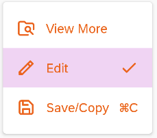
val menuItems = listOf(
    FioriMenuItem(
        text = "View More",
        leadingIcon = FioriIcon(
            iconType = IconType.RESOURCE,
            com.sap.cloud.mobile.fiori.compose.card.R.drawable.ic_sap_icon_browse_folder,
            contentDescription = "View more"
        )
    ),
    FioriMenuItem(
        text ="Edit",
        leadingIcon = FioriIcon(
            iconType = IconType.RESOURCE,
            com.sap.cloud.mobile.fiori.compose.card.R.drawable.ic_sap_icon_edit,
            contentDescription = "Edit"
        ),
        trailingIcon = FioriIcon(
            iconType = IconType.RESOURCE,
            com.sap.cloud.mobile.fiori.compose.card.R.drawable.ic_sap_icon_accept,
            contentDescription = "Accept Changes"
        )
    ),
    FioriMenuItem(
        text ="Save/Copy",
        leadingIcon = FioriIcon(
            iconType = IconType.RESOURCE,
            com.sap.cloud.mobile.fiori.compose.card.R.drawable.ic_sap_icon_save,
            contentDescription = "save"
        ),
        trailingText = "⌘C"
    )
)
Example 1
The simplest and least boilerplate way to implement a Fiori dropdown is to use the OverflowDropdownButton composable provided by Fiori. This provides a fast way to launch a dropdown menu from an overflow icon button. Internally, this calls FioriDropdownMenu.
OverflowDropdownButton(
    menuItems = menuItems,
    onItemClick = { menuItem -> ... }
)
Example 2: Using FioriDropdownMenu Directly
Another simple way to implement a Fiori dropdown is by directly calling the FioriDropdownMenu itself.
FioriDropdownMenu(
    menuItems = menuItems,
    expanded = true,
    onDismissRequest = { ... },
    onItemClick = { menuItem -> ... }
)
Example 3: Using FioriDropdownMenuItem Directly
Although the OverflowDropdownButton and/or the FioriDropdownMenu should be sufficient to use and customize, there might be an extreme case where further customization is needed on the menu item itself. Use FioriDropdownMenuItem to work directly at the menu item level and use it as a building block for Android's standard DropdownMenu. Although this use case is unlikely, it is available if needed.
Other Composables
Menu Divider Composable
The SDK provides an out-of-the-box divider called MenuDivider that can be used with drop down menus. This Composable is already used internally by FioriDropdownMenu but can be used directly if needed. It takes an optional DropdownMenuStyles parameter:
MenuDivider()
Menu Item Icon Composable
The MenuItemIcon composable is designed for dropdown menu item icons (both leading and trailing icons). This is another composable that is utilized internally by FioriDropdownMenu but can be used directly, if needed, to build a more customized dropdown menu item (such as DropdownMenuItem or FioriDropdownMenuItem.
MenuItemIcon(
    fioriIcon = FioriIcon(
        iconType = IconType.RESOURCE,
        resId = leadingIconRes
    )
)
Menu Item Text Composable
The MenuItemText composable is designed for dropdown menu item label text. This is another composable that is utilized internally by FioriDropdownMenu but can be used directly, if needed, to build a more customized drop down menu item (such as DropdownMenuItem or FioriDropdownMenuItem.
MenuItemText("Edit")
Customizing Dropdown Colors
There are two ways that you can customize the colors of the FioriDropdownMenu and FioriDropdownMenuItem.
- Using a custom theme.
- By providing custom colors to the composable function of
FioriDropdownMenu()orFioriDropdownMenuItem().
Using a Custom Theme to Customize the Fiori Dropdown Menu
Instead of using FioriHorizonTheme, use FioriCustomTheme when creating the component to apply a custom theme. For example, in the CustomThemeDropdownPreview(), we read in a custom theme with a different set of theme colors and then apply FioirCustomTheme:
@Preview("Custom Theme Dropdown")
@Composable
private fun CustomThemeDropdownPreview() {
    // Read in the custom colors from JSON file in assets/ folder
    val customColors = parseCustomColorsFromAssets(LocalContext.current, "custom-theme.json")

    if (customColors != null) {
        FioriCustomTheme(
            customColors = customColors,
            customLogo = null
        ) {
            FioriDropdownMenu(
              menuItems = menuItems,
              expanded = true,
              onDismissRequest = { ... },
              onItemClick = { menuItem -> ... }
              )
        }
    }
}
This code displays the dropdown menu as follows:
Setting the Color Parameters
The SDK provides an abstract interface called DropdownMenuColors and implementing this interface allows the application to apply colors to different parts of the dropdown menu. The SDK utilizes an implementation of the Material3 MenuItemColors, which by default is Fiori-themed but can be extended and overwritten:
backgroundColorSelected: Defines the background color for a selected item.textColor: Defines the text color of the item.leadingIconColor: Defines the leading icon color of the item.trailingIconColor: Defines the trailing icon color of the item.disabledTextColor: Defines the text color of the item when it is disabled.disabledLeadingIconColor: Defines the leading icon color of the item when it is disabled.disabledTrailingIconColor: Defines the trailing icon color of the item when it is disabled.
An application can set its own colors by implementing the DropdownMenuColors interface and passing it as a parameter of the FioriDropdownMenu:
FioriDropdownMenu(
    ...
    colors: DropdownMenuColors = AppNavigationDropdownDefaults.colors(),
    ...
)
Further Reading
Here are additional resources on the Material3 dropdown menu: