
 Usage
& Type
Usage
& Type

A group control clusters a set of controls or information: it demonstrates which parts belong together, and separates them from other parts of content.
The primary and secondary group types, consisting only of a background color, can be used to highlight a part of the content .

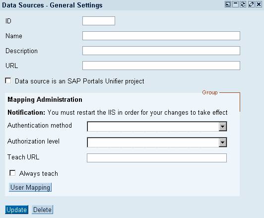
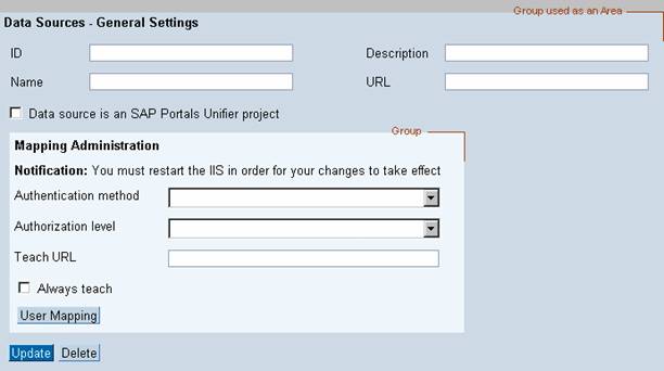
In full-page applications, the primary and secondary group types may be used to create an area into which other controls can be placed.
Usage
In full-page applications, use the group control to
· Group each coherent set of fields or information and separate one set from another.
· Define an area where text or controls can be placed
· Highlight a certain part of the application or information
Within an iView, there should normally be no need to highlight or separate different groups, since an iView is per definition small and simple. However, there are certain cases where it makes sense to use a group control to
· Highlight or separate a certain part of an iView to better demonstrate it is structure.
For example, to show whether a certain button relates to the whole application or only to a part of it
· Highlight a certain portion of textual information within a large body of text.
General Usage Tips
Use groups only if other ways of separating information or field groups do not suffice. Group boxes look similar to the tray container of iViews and may clutter the interface visually. Preferably, use white space or vertical dividing lines to group elements, relying on the Gestalt laws.

Sometimes you don't really need groups in your iView, but simply want to create a better visual structure. Instead of misusing the group control, use the text view control to give users a better overview of your content: Create a text label for each part and add a blank line between parts to separate them.
Try not to nest groups; separate subgroups within groups by lines or white space. If you need to nest groups, consider nesting different group types (see below).
Positioning
Tabstrips, table views and tree views are only allowed to be included in a group control if they appear together with other elements (see Layout Hierarchy for details). Placed as a single element, these controls do not need any further separation from their surroundings, as they already have distinct borders and a dominant shape.
Types
Depending on the items the group will contain, you can choose one of the offered styles. Currently, there are five group designs available, which are set using the attribute design.
Primary and Secondary Groups
The primary (design = PRIMARYCOLOR) and secondary groups (design = SECONDARYCOLOR) allow to visualize groups through a simple, flat background color. Both are suitable for textual content. Controls with a white background color, such as input fields and checkboxes, stand out well on both group designs.

Use primary and secondary groups to:
· Define an area in a full-page application
Note: It is recommended to use the secondary (darker) group as an area background. You may then place the primary group on top of it to highlight or group parts of the area's content.
· Highlight a part of the content
· Group a set of coherent elements
Group Box
The group box design (design = SAPCOLOR) has a transparent body background. Because of its border and header bar, it has a quite dominant appearance.

Use the group box (figure 2) to group a set of coherent elements.
Do not nest any further groups inside a group box.
Avoid putting more than one or two of this group type adjacent to one another. They create a grid-like visual effect, which makes it hard for users to determine, which border belongs to which group.
Header Groups
Header group 1 is best suited for forms; its light body background color lets white input fields stand out well.
Header group 2 has a white body background color, which makes it unsuitable for forms. Textual content and lists work best with this group style.

Design-Relevant Attributes
The look of groups can be determined by three attributes: design selects the group type (values PRIMARYCOLOR, SAPCOLOR, SECONDARYBOX, SECONDARYBOXCOLOR, SECONDARYCOLOR), width sets the width of the group, and title sets the title text.
For details refer to page Control API for Group.
Related Controls
Tabstrip, Table View, Tree View, Text View (for headers of subgroups)