
 Text View

Definition
A multiline region for displaying text. Text in the control is restricted to a single font, size and style unless set with HTML commands.
· design
Defines the appearance of the text. Design can be set to "HEADER1", "EMPHASIZED", "LABEL" and so on. The CSS controls how the different options get rendered. The following description is based on the standard CSS delivered.
¡

Bold text, text size STANDARD
¡

Bold text, text size +4 in comparison to STANDARD
¡

Bold text, text size +2 in comparison to STANDARD
¡

Bold text, text size STANDARD
¡

Text size and attributes STANDARD
¡

Text size -2 in comparison to STANDARD
¡

Italic text, text size STANDARD
¡
No text attributes and standard text size
· encode
A boolean value that defines how the text is interpreted. HTML text formatting commands (for example, <h1>, <i> etc.) can be used to change the display of the text. If there are no formatting commands in the text string, the encode attribute has no effect.
Example:
text="<h1><i>Important</i></h1>"
encode = "false" Browser output: 
the text string is rendered by interpreting the formatting commands.
encode = "true" Browser output: 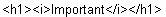
the formatting commands are displayed and not interpreted.
· hoverMenuId
Defines which hover menu is displayed for this tree node. You can define different trigger methods to display the hover menu. For more details, see hover menu.
· id
Identification name of the text.
· labeled
Enables or disables the notification when the control has a label assigned to it.
· layout
Defines the alignment of the text.
¡ BLOCK
Renders the textView with a <div> HTML tag.
¡ NATIVE
Renders the textView with a <span> HTML tag.
¡ PARAGRAPH
Renders the textView with a <p> HTML tag
· required
Deprecated - the control 'label' should be used instead to label required input fields.
A boolean value. If set to "true" an asterisks (*) in red color is placed at the end of the text string. This is a common method to indicate that input is required. See also inputField and label.
· text
Defines the string of text displayed. See 'encode' for a formatting example with embedded HTML commands.
· tooltip
Defines the hint of the textView which is displayed as the mouse cursor passes over the textView, or as the mouse button is pressed but not released.
· width
Defines the width of the textView. The width shows only effect when the 'wrapping' attribute is set to "true". Otherwise the width and layout follows the HTML commands in the text string.
· wrapping
A boolean value. If set to "true" the text is word wrapped at the set 'width' or - if no 'width' is set - at the form width.
Attributes |
M |
Values |
Usage |
design |
|
EMPHASIZED |
Taglib Classlib |
encode |
|
FALSE |
Taglib Classlib |
hoverMenuId |
|
String (cs) |
Taglib Classlib |
id |
* |
String (cs) |
Taglib Classlib |
labeled |
|
FALSE
(d) |
Taglib Classlib |
required |
|
FALSE
(d) |
Taglib Classlib |
text |
|
String |
Taglib Classlib |
tooltip |
|
String |
Taglib Classlib |
width |
|
Unit (100%) |
Taglib Classlib |
wrapping |
|
FALSE
(d) |
Taglib Classlib |
Example
using the taglib
<hbj:textView |
using the classlib
Form form = (Form)this.getForm(); |
Result
