Tabstrip

Definition
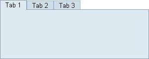
A container that enables the user to switch between several panels -by clicking on the tab - that appear to share the same space on the screen. The user can view a particular panel by clicking its tab. Use tabStripItem to define the panel size and title. Use tabStripItemBody to define the layout of the tabStripItem. Use tabStripItemHeader to change the settings of the title (specified through tabStripItem).
· bodyHeight
Defines the height of panel. The tabs are added on top of panel. The height of the tabs is defined by used text font.
· horizontalAlignment
Defines the horizontal alignment of the tapStripItems.
¡ LEFT
Left justifies the content of the cell.
¡ RIGHT
Right justifies the content of the cell.
¡ CENTER
Centers the content of the cell.
¡ CHAR
Aligns text around a specific character. Not supported by all web clients.
¡ JUSTIFY
Sets text in the cell left and right aligned. Not supported by all web clients.
· id
Identification name of the tabStrip.
· selection
Defines which tab is the active/displayed panel.
· tooltip
Defines the hint of the tab which is displayed as the mouse cursor passes over the panel of the tabStrip, or as the mouse button is pressed but not released.
· verticalAlignment
Defines the vertical alignment of the tapStripItems.
¡ BASELINE
The content of the cell is aligned on the baseline line of the cell (or bottom when no baseline exits).
¡ BOTTOM
The content of the cell is aligned to the bottom line of the cell.
¡ MIDDLE
The content of the cell is aligned to the middle of the cell height.
¡ TOP
The content of the cell is aligned to the top line of the cell.
· width
Defines the overall width of the tabStrip control.
Attributes |
M |
Values |
Usage |
bodyHeight |
|
Unit (100) |
Taglib Classlib |
horizontalAlignment |
|
CENTER
(d) |
Taglib Classlib |
id |
* |
String (cs) |
Taglib Classlib |
selection |
|
Numeric (1) |
Taglib Classlib |
tooltip |
|
String |
Taglib Classlib |
verticalAlignment |
|
BASELINE |
Taglib Classlib |
width |
|
Unit (400) |
Taglib Classlib |
tabStripItem
Specifies the panel size and the tab of a tabStrip. Use tabStripItemBody to define the layout of the tabStripItem. Use tabStripItemHeader to change the settings of the title later on. A tabStripItem must have a unique 'id' and 'index' attribute and can call a specific event handler that is activated when this tab is clicked.
· header
The tab can have text (set by the 'title' attribute) or any other control. 'header' specifies the component. Common use would be to display icons in the tabs (instead of text).
· height
Defines the height of the tabStripItem.
· id
Identification name of the tabStripItem.
· index
Defines the index of the tabStripItem. The 'selection' attribute of the tabStrip refers to the 'index'. The 'index' is mandatory and can be alphanumeric.
· onSelect
Defines the event handling method that will be processed when the user clicks on the tab. The string for the event name is not case sensitive - the reference however has to be spelled exactly the same way as the definition of the 'onSelect' event.
If you define a 'onSelect' event, you have to switch to the new selected tab in your application, using the tabstrip method selection (see above). If you do not define a 'onSelect' event the tab can be clicked, the selected tab is displayed, but no event is generated.
· title
Defines the text that is displayed in the tab itself.
· tooltip
Defines the hint of the tab which is displayed as the mouse cursor passes over the panel of the tabStrip, or as the mouse button is pressed but not released.
· width
Defines the overall width of the tabStripItem.
Attributes |
M |
Values |
Usage |
header |
|
Component
|
Taglib Classlib |
height |
|
Unit |
Taglib
Classlib |
id |
* |
String (cs) |
Taglib
Classlib |
index |
* |
String (cs) |
Taglib
Classlib |
title |
|
String |
Taglib
Classlib |
tooltip |
|
String |
Taglib
Classlib |
width |
|
Unit |
Taglib
Classlib |
Events |
M |
Values |
Usage |
onSelect |
|
String (cs) |
Taglib Classlib |
tabStripItemBody
Specifies the layout of the tabStripItem.
tabStripItemHeader
The tabStripItem attributes 'title' and 'header' can be altered or set by tabStripItemHeader (see following example definition of "tab 4").
Example
using the taglib
<hbj:tabStrip |
using the classlib
Form form = (Form) this.getForm(); |
Result