
Arrangement on Data Screens
Data Screens vs. Initial Screens
When using pushbuttons with no fixed position in primary windows, you have to distinguish between initial screens and data screens. For this reason, these screens are dealt with separately.
Using pushbuttons with no fixed position in dialog boxes is discussed afterwards.
Use
Pushbuttons with no fixed positions can be used on data screens for:
Generally, a dialog box with additional information is sent. This can include further heading data, reference data or long texts, for example.
This can include Print, Scroll or Delete, for example.
The attributes can refer to the entire window (for example, hide/show heading) or to individual fields.
Pushbuttons on screens for calling detailed information, actions and for setting screen attributes
Window- or Object-Related Pushbuttons
Pushbuttons which refer to the entire window or the full object are in the
Application Toolbar (Control Element) or Standard Toolbar.Field-Related Pushbuttons
Pushbuttons which refer to fields are to be placed to the right of the field that they activate. In this case, the pushbuttons that are on top of one another should be aligned and, if necessary, should end at the right of the group box (see
Group Box (Control Element)). The buttons, however, should be close to the respective entry field so that they can be assigned instantly to the input fields.Field-related pushbuttons should not appear in group boxes but should always be within the box of the group whose fields they activate.
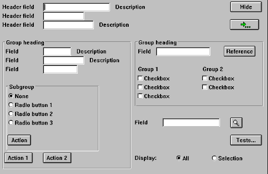
Pushbutton on the long text as an example of a field-related pushbutton (middle right); pushbuttons which refer to the entire object are located at the upper window edge
Possible Entries Pushbutton
The Possible entries pushbuttons which are automatically displayed directly to the right of the field are a special case (see
Possible Entries Pushbutton (Control Element), Possible Entries (Function)).
Possible Entries Pushbutton (Possible entries pushbutton, F4 functionality)
Group-Related Pushbuttons
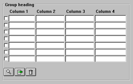
Group-related pushbuttons are generally to be positioned at the bottom of the group. They should not be centered but left-aligned with the upper fields or group boxes.
A pushbutton in a
Group Box (Control Element) should always start in the first free column in the group box.
Group-related pushbuttons
Table-Related Pushbuttons
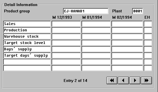
Table-related pushbuttons are separated by one line from the table. They can be scroll functions, edit functions and functions for the positioning.
Pushbuttons on a Table With Table Functions
Scroll Functions
The scroll buttons are right-aligned below the table. A possible existing page display should be positioned to the left next to it or in the line above. The scroll buttons should be within the box enclosing the table if they refer exactly to the table. If they affect several tables, they should be outside the boxes. All pushbuttons should have a length of three characters. For scroll functions and their respective icons see
Pushbuttons with Icons on Data Screens.
Horizontal scroll buttons
Conflicts With the Scroll Arrows of the Standard Toolbar
If there is only one step loop on the template, the vertical scroll buttons perform the function as the scroll arrows of the
Standard Toolbar, however they do not interfere with one another. In this case, it is best not to include vertical scroll buttons.If there are two or more step loops on the template, the general scroll functions (
F21-F24 ) have to be switched off, since it is no longer clear to which step loop they refer. In this case, pushbuttons with no fixed position have to be added for vertical scrolling.Size
All pushbuttons on a screen should generally be the same width. Adjacent pushbuttons of a group have to be the same width.
Minimum Width
Pushbuttons should be at least three characters wide. As for field names, the space required for the translation (see
Translation) is to be taken into account. For technical reasons, however, you always have to add a blank (to be entered as an underscore) because of the proportional font.Maximum Width
Pushbuttons in the work area should not be wider than 30 characters.
Height
Pushbuttons automatically have the height of one line.