
 Usage
& Type
Usage
& Type

Input fields are used for entering and displaying data in forms. The data can be of various types, such as Date, Integer, or String.
Input fields can have different behaviors, such as password, read-only, or required, and different states, such as normal and error.
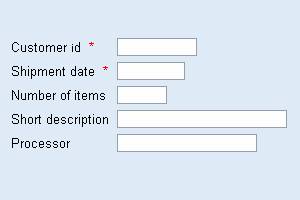
Figure 1: Example of grouped input fields with and without required inputs
Usage
In most cases, input fields appear in combination with the label control and sometimes with additional elements, such as descriptions or buttons.
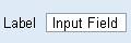

Figure 2: Input field with label (left) and additional elements
Typically, the label is placed left to the input field, while the description follows the field. There is one exception to this rule: You may use small labels if you place the labels above input fields to achieve a more compact design (figure 3).
Figure 3: Use small labels for labels that are placed above their associated input fields
In addition, help texts can be placed right to the field below it.
Help Texts
Help texts are special descriptions that are placed behind the input field or - if space is limited - below the input field and left-aligned with it (figure 4). Do not use the label control for help texts. Use the text view control, instead. Set the help text size to small (style Legend).
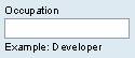
Figure 4: A small label used in conjunction with a small help text below the associated input fields - do not use the label control for the help text (below the input field)
Width and Alignment
Often input fields are grouped to form a semantic block of input data, such as address data, or bank data. In that case, input fields should indicate how many characters the user has to enter. Therefore, it is not appropriate to set all fields within a group to the same size. That is important because input fields are often used in combination with other input types, such as checkboxes and radio buttons.
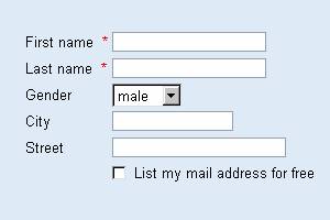

Figure 5: Example of grouped input fields with the width attribute set to appropriate values
Use the grid layout control for aligning fields and labels. Both fields and labels are left-aligned within the grid. The number of characters of the longest label determines the offset between the labels and the input fields.
Types
Input fields come in two sizes: standard size and small size. They are set using the attribute size to STANDARD (default) or SMALL.
Usage - Sizes
Usually, only the standard size is used. If the screen real estate is limited, the small size might be appropriate. Do not mix small and standard input fields within one field group.
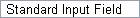

Figure 6: Standard input field (left) and small input field (right)
Design-relevant Attributes
A number of attributes allow to display several different states and behaviors of an input field, such as read-only, error, password field and required field.
|
Read-only Input Field |
|
|
Invalid Input Field |
|
|
Password Input Field |
|
|
Required Input Field * |
|

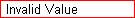

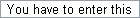
Figure 7: Different states of input fields
These states and behaviors are set by assigning the value TRUE to the Boolean attributes disabled, invalid, password, and required.
The data type of input fields, such as Integer, String, etc., is set using the attribute type. For possible values and further attributes, see page Control API for Input Field.
In addition, there are specialized input fields, which may also be accompanied by a value help. Below, we present the date field as example (this is currently the only type of value help that is supported - see page Control API for Input Field for details).

Figure 8: Date input field with date picker
Usage - Required Fields
Some fields require that users enter a value before they can continue, for example, before they can save data. Set required = TRUE for making an input field a required field; its corresponding label has also to be set to required.
Usage - Read-only Fields
Read-only fields (disabled = TRUE) are input fields that do not allow users to enter data.
Use read-only fields for data that have previously been entered by the user, for example, on a preceding page or during a previous session, or by the system, and that currently cannot be changed by the user. Often, the data that the user is allowed to enter depend on the protected data that are displayed in a read-only field.
Usage - Password Fields
Use password fields (password = TRUE) when users have to enter a password, for example, in a login dialog.
Usage - Invalid Fields (Error State)
Set the error state for an input field (invalid = TRUE), whenever the system detects an input error that the user committed. Depending on the system behavior, an additional error message should appear immediately, or after a certain "stable" system state has been reached, when the system performs a more thorough error check.
Related Controls
Label, Checkbox, Radio Button, Grid Layout, Flow Layout, Group