Grid Layout

Control API
A grid is a two
dimensional arrangement of data in rows and columns. To avoid unexpected
results, the rows and columns should always be defined by gridLayoutCells
instead of using the 'columnSize' and 'rowSize' attribute. With the
gridLayoutCell you have control over the width of the gridLayoutCell while
using the "columnSize" the renderer and web client take the control.
Especially in combination with 'debugMode' attribute set to "FALSE", the
layout of the grid is not displayed as expected.
If no gridLayoutCells are defined no gridLayout is displayed.
Limitation:
Large gridLayouts (large amount of rows and columns) can cause problems
like:
¡ Compiler errors that are caused by a 64kB method length limit.
¡ Slow processing of page because of huge HTML-Code generated by the JSP-Compiler
To avoid these problems you could use the gridLayout tag and combine it with <tr> & <td> tags.
cellPadding
Defines the padding of
each cell in the grid layout. The value of the cell padding attribute
represents the distance from the border of the cell to the content of each
cell specified in pixels.

The cellPadding is applied to the top, left, right and bottom of the cell.
cellSpacing
Specifies the space
between the left side of the gridLayout and the left-hand side of the leftmost
gridLayoutCell, the top of the gridLayout and the top side of the topmost row
and so on for the right and bottom of the gridLayout. The attribute also
specifies the amount of space to leave between the gridLayoutCells.
Defines the spacing between cells and the outer boundary in the grid layout in
pixels.
columnSize
Defines the number of
columns for the gridLayout. The columns are defined with the gridLayoutCell
control and 'ColumnSize' is overruled by the gridLayoutCell
definition.
debugMode
A Boolean value. If set
to "TRUE" the gridLayoutCell is rendered with a frame. The frame size is
defined by gridLayoutCell 'width' and the 'cellpadding'. If a gridLayoutCell
is not defined or empty no frame is displayed.
If set to "FALSE" no frame is rendered. Please check the gridLayout
description above for limitations.
By default the borders of the grid are invisible. To see the borders for layout and debug reasons set the debug attribute.
Setting the debugMode attribute will add pixels to visualize borders. Therefore the sizes of the grid layout will change if you reset the attribute. The debugMode attribute, as indicated by the name, should only be used for debugging and not for "styling".

heightPercentage
Sets the height of the
grid in percent.
id
Identification name of
the gridLayout.
rowSize
Defines the number of rows for the gridLayout. The 'rowSize' is overruled when
more rows are defined with the gridLayoutCell control then specified with the
'rowSize' attribute. If 'rowSize' is higher than the rows defined by the
gridLayoutCell, the frame height of the gridLayout is extended.
width
Defines the width of the
gridLayout. If the 'width' in gridLayoutCell is specified in percent, the
percentage will be calculated from the width of the gridLayout and not from
the width of the form.
If the gridLayoutCell definition exceeds the 'width' of the gridLayout the
gridLayoutCell content will be wrapped.
Attribute |
M |
Values |
Usage |
cellPadding |
|
Numeric (0) |
Taglib Classlib |
cellSpacing |
|
Numeric (0) |
Taglib Classlib |
columnSize |
|
Numeric (0) |
Taglib Classlib |
debugMode |
|
FALSE (d) TRUE |
Taglib Classlib |
heightPercentage |
|
Numeric (0) |
Classlib |
id |
* |
String (cs) |
Taglib id="ZIPCode_grid" Classlib |
rowSize |
|
Numeric |
Taglib Classlib |
width |
|
Unit (100%) |
Taglib Classlib |
gridLayoutCell
Defines the cells in the gridLayout.
columnIndex
Defines the horizontal
position of the cell.
colSpan
Defines the horizontal
expansion the cell in percent. If you specify for example, 100, the cell uses
the whole gridLayout width. Cells right of this cell are omitted. A possible
application for this attribute is to display headlines in the gridLayout.
content
Specifies the content
for the cell.
heightPercentage
Sets the height of the
gridLayout cell in percent.
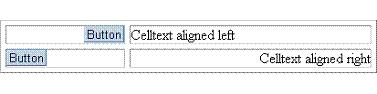
horizontalAlignment
Defines the horizontal
alignment of the cell content.
LEFT
Left justifies the content of the cell.
RIGHT
Right justifies the content of the cell.
CENTER
Centers the content of the cell.
CHAR
Aligns text around a specific character. Not supported by all web clients.
JUSTIFY
Sets text in the cell left and right aligned. Not supported by all web
clients.
id
Identification name of
the gridLayoutCell.
rowIndex
Defines the vertical
position of the cell.
style
Defines the stylesheet
to be used to display the cell.
verticalAlignment
Defines the vertical
alignment of the cell content.
BASELINE
The content of the cell is aligned on the baseline line of the cell (or bottom
when no baseline exits).
BOTTOM
The content of the cell is aligned to the bottom line of the cell.
MIDDLE
The content of the cell is aligned to the middle of the cell height.
TOP
The content of the cell is aligned to the top line of the cell.
width
Defines the width of the
gridLayoutCell. One column can have only one width - when you specify
different widths for the same column the width defined last is
taken.
Attribute |
M |
Values |
Usage |
columnIndex |
* |
Numeric |
Taglib Classlib |
colSpan |
|
Numeric (0) |
setColSpan(100) |
content |
|
String |
Classlib Component: setContent(ListBox) |
heightPercentage |
|
Numeric (0) |
Classlib |
horizontalAlignment |
|
LEFT (d) RIGHT CENTER CHAR JUSTIFY |
Taglib Classlib |
id |
|
String (cs) |
Taglib Classlib |
rowIndex |
* |
Numeric |
Taglib Classlib |
style |
|
String |
Taglib Classlib |
verticalAlignment |
|
BASELINE BOTTOM MIDDLE (d) TOP |
Taglib Classlib |
width |
|
Unit |
Taglib Classlib |
Example
Using the taglib
<hbj:gridLayout |
Using the classlib
Form form = (Form)this.getForm(); |
Result