
 Radio Button

Definition
A button that a user clicks to set an option. Unlike checkboxes, radio buttons are mutually exclusive - selecting one radio button menu item deselects all others in that group. That is also the reason why you cannot define a radioButton by itself - it always has to be defined within a radioButtonGroup. The radioButton control can be for client side eventing. See the EventValidationComponent description for more details.
· enabled - inherited from the EventValidationComponent.
A boolean value that defines if the radioButton is click able. If the radioButton is disabled (enabled = false) it is not selectable. A disabled radioButton has a different background color for the radioButton graphic and if the radioButton is checked the a different color for the button mark.
· encode
A boolean value that defines how the radioButton text is interpreted. HTML text formatting commands (for example, <h1>, <i> etc.) can be used to change the display of the radioButton text. If there are no formatting commands in the radioButton text string, the encode attribute has no effect.
Example:
text="<h1><i>Walldorf</i></h1>"
encode = "false" Browser output: 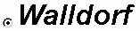
the text string is rendered by interpreting the formatting commands.
encode = "true" Browser output: 
the formatting commands are displayed and not interpreted
· id
Identification name of the radioButton.
· jsObjectNeeded - inherited from Component.
A boolean value that defines if a JavaScript object has to be generated for the radioButton component.
· key
A string which is assigned to the radioButton when the form is sent to the server. A key string must be defined and must not be empty.
· labeled
Enables or disables the notification when the control has a label assigned to it.
· selected
Sets the status of the radio button. Is selected set to "true", a filled circle is displayed inside the radio button.
· text
Defines the string of text placed right of the radiobutton graphic. If no text should be displayed an empty string (null) can be used. See 'encode' for a formatting example with embedded HTML commands.
· tooltip
Defines the hint of the radioButton which is displayed as the mouse cursor passes over the radioButton, or as the mouse button is pressed but not released.
Attributes |
M |
Values |
Usage |
enabled* |
|
FALSE |
Taglib Classlib |
encode* |
|
FALSE |
Taglib Classlib |
id |
* |
String |
Taglib Classlib |
jsObjectNeeded |
|
FALSE
(d) |
Taglib Classlib |
key |
|
String |
Taglib Classlib |
labeled |
|
FALSE
(d) |
Taglib Classlib |
selected |
|
FALSE
(d) |
Taglib Classlib |
text |
|
String |
Taglib Classlib |
tooltip |
|
String |
Taglib Classlib |
* Method is inherited from the EventValidationComponent component. Therefore the attribute is different between the taglib and the classlib.
** Method is inherited from the Component component.
See the JavaScript API description for details how to access the component in JavaScript.
Example
A radioButton has to be used together with a radioButtonGroup. Refer to the radioButtonGroup documentation for the example.