
 Usage
& Type
Usage
& Type

The tabstrip is a container that allows the user to switch between several views by clicking the tabs. The views appear to share the same space on the screen. The user can access a particular view by clicking its tab.
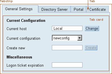
Figure 1: Example of a tabstrip control with an individual tab and the tab card indicated
Usage
Advantages
· Users can see all the alternative views at once. Thus users have a stable context and can navigate easily between the views.
· Tabstrips are also the ideal choice for presenting multiple views of information when the views look very different from one another and a different form of presentation would cause an unstable environment.
Disadvantages
· Tabstrips consume a lot of space compared to other view switching alternatives (for example, radio buttons or dropdown list box shufflers). For views and alternatives to tabstrips that consume less space, see Related Controls.
· Another disadvantage of tabstrips is that the number of views is limited by the space for the tabs.
Do
· Tabstrips may contain dynamic information so that users get a quick overview of important data, events or changes within the views.
· The tab card may contain tables and group boxes.
Don't
· Avoid using long names in the tab labels and using too many tabs, as this will cause the control to be very wide and may cause problems such as scrolling or excessively wide iViews.
· Tabs may not contain icons.
· Tabstrips indicate to the user that views can be accessed in any order; if this is not the case, then avoid using tabstrips.
· Although space is limited in the tab card, it should not be scrolled.
· Tabstrips may not be nested inside one another!
General Usage Tips
Use tabstrips for selecting views only if other alternatives lead to an unstable interface that might confuse users: Tabstrips appear rather massive, and they take a lot of screen real estate. Furthermore tabstrips should only be used for tasks without a prescribed order of steps as they communicate freedom of choice of interaction sequence.
Design-relevant Attributes
The appearance and behavior of tabstrips can be affected by various attributes.
· Height and Width
Attribute bodyHeight sets the vertical size of the tabstrip panel, attribute width the overall width of the tabstrip.
· Horizontal and Vertical Alignment of Tabs
Use attributes horizontalAlignment (values CENTER, CHAR, JUSTIFY, LEFT, RIGHT) and verticalAlignment (values BASELINE, BOTTOM, MIDDLE, TOP) to align the tabs.
· Selected Tab
Attribute selection selects a tab.
· Tooltip Text
Use attribute tooltip to set the tooltip text for a tabstrip as a whole.
In addition for each view (or tabstrip item) several attributes can be set individually:
· Height and Width
Attribute height sets the vertical size of the tabstrip view, attribute width its width.
· Tab Text
Attribute title sets the label for the tab.
· Tooltip Text
Use attribute tooltip to set the tooltip text for a tabstrip view.
For details see page Control API for Tabstrip.
Related Controls