
 Usage
& Type
Usage
& Type

Radio buttons provide users with a single choice from a set of alternative options.

Figure 1: A radio button group
Usage
Radio buttons provide users with a single choice from a set of alternative options. They always appear in a group of at least two radio buttons. Therefore, you should define radio buttons only within the radio button group control, not as single elements.
A click on one choice selects the current choice and deselect the previous choice. Usually, always one radio button is checked. The Internet introduced one exception to this rule. In some cases, a radio button group can initially show up with no radio button checked.
Note: It is not possible to determine the horizontal spacing within a radio button group. If you need a different spacing than that supplied by the radio button group control, use single radio buttons and a grid layout control if applicable.
Arrangement and Design Alternatives
Radio button groups offer users a set of alternative choices that may be arranged either horizontally (2-3 radio buttons), vertically (not more than about 12 radio buttons), or in a matrix-like fashion. Note that radio button groups are appropriate for static and relative small numbers of options only. Use the table view for larger and dynamic data sets.
Alignment
For the alignment of radio buttons we distinguish the following cases:
· Radio buttons that refer to adjacent fields.
· Radio buttons that do not refer to elements but should be included in field groups.
· Radio buttons that can be arranged as an independent block of information
In general, the first two cases are not as common as for checkboxes.
Case 1: Radio Buttons that Refer to One or More Fields
Align dependent radio buttons with the left border of other input elements (figure 1). Place the radio button labels right to the radio button (this is done automatically for the radio button control).

Figure 2: A pair of radio buttons that refers to the input field above it (profession)
If there are too many alternatives, consider using a dropdown list box instead of the radio button group. As noted below, this arrangement should only be used if there is a dependency from other fields above the radio button group.
Case 2: Radio Buttons that are Included in a Field Group
If radio buttons are included in a field group but do not refer to a certain field, do the following (figure 3a-b):
· Place the description of the radio button group to the left of the group and align it with the other field labels.
· Align the radio buttons with the other input fields.
· Use a label control for the group label
You can use a vertical radio button group, or if space permits a horizontal radio button group that occupies only one line.
|
|
|

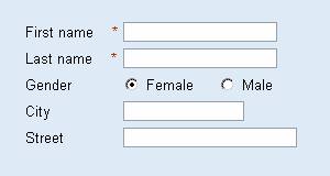
Figure 3a-b: Radio buttons within a field group with group label to the left ( left shows vertical, right shows horizontal arrangement)
In general, radio button groups within a field group should have a descriptive label for the group and a label to the right of each radio button.
Rationale: A radio button group is functionally equivalent to a dropdown list box. The group label corresponds to the label for the dropdown list box; the labels to the right of the radio buttons correspond to the list box items
|
|
|
|
Wrong level of labels (male/female is are subcategories). |
Wrong alignment because the radio buttons do not refer to the name fields. |

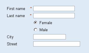
Figure 3c-d: Radio buttons within a field group with two labels to the left of the radio buttons (left) and to the right (right)
Do Not
· A layout without a label for the radio button group and with labels to the left (figure 3c) is harder to understand because the labels are not on the same semantic level as the surrounding field labels.
· Also do not use an arrangement without a group label in this case (figure 3d) because it is equally hard to understand and may lead to misinterpretations. Such a layout suggests a dependency from the field above the group to the user. Even though the layout in figure 3d is the same as in 1a, the usage is incorrect because the radio buttons do not refer to the "Last name" field. Therefore, use it only if such a dependency does exist (case 1).
Case 3: Radio Buttons that Form an Independent Information Block
If radio buttons are arranged in a separate radio button group, arrange them in a matrix-like fashion and left-align them with other elements on the page or in the application. Such groups have either to be included in a group control (see figure 4a) or separated from the field group by white space (figure 4b).
|
|
|
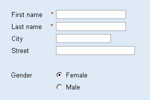
Figure 4a-b: Radio button group that forms an information unit of its own - either included in a group (left) or separated by an empty line (right)
Instead of a matrix, you can use a horizontal arrangement if there are only few radio buttons. In this case, set the columnCount attribute of the radio button group control to a value that results in one row only.
There are two possible arrangements for horizontal radio button groups:
· The radio button row can be introduced by a label to the left or a header above - in this case align the radio buttons with other elements and use the label control for the label or header (figure 5a-b).
· The radio button row does not have an introductory label (figure 5c-d).
Separate the horizontal radio button group from preceding fields by an empty line.
|
|
|

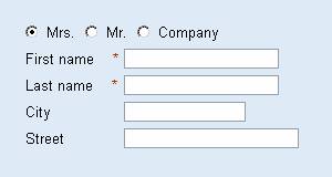
Figure 5a-d: Horizontal radio button groups, either with an introductory label to the left (top left), a heading (bottom left), or without an introductory label (right)
Do not use a single radio button because there are two problems with it: (1) Users cannot deselect a single radio button; after it has been selected, it remains so. (2) Users see the name of one option only; they often can only guess what the alternative option is.
Dependent Fields
In some cases, the state of an input field, dropdown list box, or other control may depend on the setting of a radio button group. Below we present two simple examples, where users may either enter their nationality (figure 6a), or their payment method (figure 6b). The first radio button describes the default case; if it is set, the input fields below it are read-only. The second radio button describes the less frequent case; if it is set, the dependent input fields are ready for input. Alternatively, in the first example a dropdown list box could be used instead of the input field if the alternatives are known and their number is not too large.
|
|
|


Figure 6a-b: Vertical radio button group that controls the editability of one (left) or several (right) input fields below the group
Do not use this layout for more than one dependent element. If there are more dependent elements indent the dependent group so that the labels are left aligned with other input fields (figure 6b).
Design Alternatives
Radio buttons are similar in function to dropdown list boxes and list boxes with respect to offering users a single choice. Use radio buttons for very small item numbers (2-6) and if the users should immediately see all alternatives.
Design-relevant Attributes
Radio buttons have the disabled attribute. Set disabled to TRUE if users are not allowed to change their state temporarily. Attribute text sets the descriptive label text for a radio button.
For radio button groups there are two relevant attributes: You can determine which radio button is "on" in a group; set attribute selection to the id of the respective radio button. You can also set the column count for radio button groups (attribute columnCount).
Related Controls