
 TriStateCheckBox

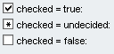
A TriStateCheckBox is an extension of a checkbox which can have the values true and false and also the state undecided. The UI element consists of a graphic with text. The checkmark in the box indicates that the option is selected and the value is set to true, and an asterisk indicates the status undecided, as the following graphic illustrates:
Description of UI Element Properties
● activateAccessKey
Indicates whether access key for this control is activated. More information: Enabling Access Keys
● explanation
specifies the explanation text. More information: Explanation
● state
Describes the status of the TriStateCheckBox. Checked is represented by the enumeration type WDTriState and can have the following values:
○ true
○ undecided
○ false
● readOnly
Specifies whether or not the user can check the checkbox.
● state
The data type of this property corresponds to the enumeration type WDState. You can use the following values:
normal |
Describes the default state of the UI element. |
required |
Specifies whether the entered value is required. A red asterisk appears next to the text. |
● text
Specifies the text that is associated with the checkbox graphic and displayed to the right of the box.
● textDirection
Specifies the text direction and allows you to read texts in languages which require a specific text direction. The textDirection property can be filled with the following values and is represented by the enumeration type WDTextDirection.
The text direction is inherited from the parent element. Therefore, the text direction is identical to the one of the parent element. |
|
The default value for this property is inherit.
Properties Overview
Name |
Interface |
Type |
Initial Value |
Bindable |
activateAccessKey |
IWDTriStateCheckBox |
boolean |
false |
not bindable |
checked |
IWDTriStateCheckBox |
WDTriState |
false |
bindable_mandatory |
enabled |
IWDUIElement |
boolean |
true |
bindable |
explanation |
IWDTriStateCheckBox |
String |
|
not_bindable |
readOnly |
IWDTriStateCheckBox |
boolean |
false |
bindable |
state |
IWDTriStateCheckBox |
WDState |
normal |
bindable |
text |
IWDTriStateCheckBox |
String (TranslatableText) |
|
bindable |
textDirection |
IWDTriStateCheckBox |
WDTextDirection |
inherit |
bindable |
tooltip |
IWDUIElement |
String (TranslatableText) |
|
bindable |
visible |
IWDUIElement |
WDVisibility |
visible |
bindable |
Events
● onToggle (WDTriState newChecked, WDTriState oldChecked)
The onToggle event is triggered when the user clicks the TriStateCheckBox. The parameters are the old and the new status.