
 Explanation

Definition
The Explanation UI element displays a multi-line help text for the entire screen or a defined area of the screen. You can place the Explanation UI element in the same way as all other UI Elements.
To display the help texts, the application must be started using parameter sap-explanation=x. SAP NetWeaver Portal offers a configuration to switch the help mode on for a Web Dynpro application.
You can also define explanation as a property of the following UI elements:
Button, CheckBoxGroup, FileUpload, TableColumn, TableColumnGroup, RadioButton, RadioButtonGroupByIndex and RadioButtonGroupByKey, InputField, DropDownByKey, DropDownByIndex, TextEdit, CheckBox, TriStateCheckBox and ItemListBox.
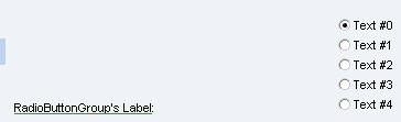
If there is an explanation text defined for the UI element and the explanation parameter is set, the UI element’s label is displayed underlined in green.
Description of UI Element Properties
● text
Determines the explanation text.
Properties Overview
Name |
Interface |
Type |
Initial Value |
Bindable |
enabled |
IWDUIElement |
boolean |
true |
bindable |
Text |
IWDExplanation |
String (Translatable Text) |
|
not_bindable |
Tooltip |
IWDUIElement |
String |
|
bindable |
Visible |
IWDUIElement |
WDVisibility |
visible |
bindable |