
 Usage
& Type
Usage
& Type

The text view control offers a multiline region for displaying text; several text attributes can be defined.
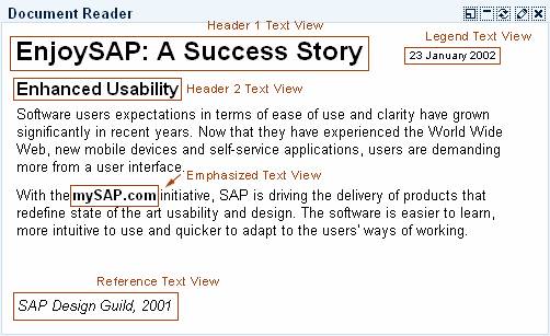
Figure 1: Example of a text view control in an iView.
Usage
The text view control is used to display plain text. The text in the control is restricted to a single font, size and style unless set with HTML commands. The text size can be set using different styles (see "Types of Text Views")
Note: The text View control must not be used to create a label for input fields; use the label control instead.
Also note that if you occupy a certain area on the screen for a text view control you should reserve enough space for the translation to other languages. Text in other languages may use up to 30% more space than needed in English.
Types
The text view control is available in several text styles, which are set by the attribute design (values STANDARD, EMPHASIZED, REFERENCE, LEGEND, HEADER1, HEADER2, HEADER3). The following description is based on the standard CSS delivered:
Text Style |
Use |
|
Used to display body text. |
|
Used to display emphasized text for example, phrases, single terms; not to be used for complete text areas; text size "Standard". |
|
Style for Text Used as a Reference; text size "Standard". |
|
Used to display a legend or small-size help text; text size -2 in comparison to "Standard". |
|
Used to display a headline or page title; text size +4 in comparison to "Standard" |
|
Used to display a page subtitle; text size +2. |
|
Used to display a subtitle; text size "Standard". |


Table 1: Text styles and their use
Design-relevant Attributes
While the different text types are set using the attribute design (values STANDARD, EMPHASIZED, REFERENCE, LEGEND, HEADER1, HEADER2, HEADER3), the appearance of the different text types can be determined by a style sheet (CSS).
The text itself is set by the attribute text, an accompanying tooltip text by the attribute tooltip.
In addition, alignment (attribute layout, values BLOCK, NATIVE, PARAGRAPH), wrapping behavior (Boolean attribute wrapping), and width (attribute width) can be defined for the text view control.
For details see the Control API for Text View.
Related Controls