
 Usage
& Type
Usage
& Type

The table view allows to arrange data - text, images, links, other tables etc. - into rows and columns, that is, in a tabular fashion. Table view rows may be grouped into a header, body and footer section. The table view supplies navigation buttons for scrolling the table. In addition, the table view offers mechanisms for single and multiple selection of rows.
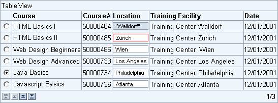
Figure 1: Example of a table view with different column types and an erroneous input field
Usage
Table views are primarily used as data tables for displaying numeric or non-numeric tabular data. Table views can be read-only or used for data entry. Depending on the usage of the table view, different looks and behaviors can be chosen.
General Usage Tips
Tables are relatively complex screen elements that lead developers to squeezing in lots of information. Keep tables small with respect to the number of columns and rows.
For long tables consider effective filtering methods like the shuffler: These tools effect that only a few rows are displayed and that users need not scroll, or need to scroll only a little bit.
Also, consider alternative presentations, such as charts or graphs - they may reveal relevant information faster.
Look
The table view can be presented in three alternative looks:
· Grid and background - either with alternating row colors or with a uniformly colored background.
· Transparent, that is, without grid and background.
Selection rules for the different table view presentations:
· Grid and uniform background
Use this look preferably for entry tables and for numeric display tables. Use the uniformly colored background also for narrow to medium wide display tables.
· Stripe pattern background
Use the alternative stripe pattern preferably for data entry tables and for wide display tables.
· Transparent background
Use this look preferably for non-numeric display tables, that is, for tables, which display text and/or images.
Table Title and Table Parts
A table view consists of three main parts: a header row, the table view body, and a footer row.
· The table view header contains the table view's title. A table view should have a title if the table is not described elsewhere (for example, by a group or tray title).
· The table view body contains the actual data.
· The table view footer is located in the bottom row; it contains the scroll buttons to the left and an optional text. The footer text may, for example, offer paging information.
The header row as well as the footer row can be hidden. Note that hiding the footer also hides the scroll buttons.
Row and Column Headers
Row and column headers describe data columns and rows. Typically, a table view has only column headers; these describe the different attributes of items that are listed in rows. Row headers can be used, for example, in matrix-like tables, which have both row and column titles.
Cell Content
Table view cells can contain text, images or icons, links, buttons, input fields and dropdown list boxes.
Like stand-alone input fields, input fields in tables can have different attributes, such as required, read-only, or error state.
Row Selection
The table view can be used in two selection modes, if needed:
· single-selection (radio buttons in the first table column)
· multiple-selection (checkboxes in the first table column)
These mode are set by assigning the values SINGLESELECT or MULTISELECT to the attribute selectionMode.
In the default mode of the table view (selectionMode = NONE) users cannot select any rows. Use this mode if there is no need for users to select rows/items. Use single-selection if users shall only select one row, that is, one item, at a time. Use multiple-selection if users can select several options or items in parallel.
Scrolling
The table view offers up to six buttons for scroll functions: First page, Page up, Line up, Line down, Page down, and Last page. The scroll buttons are invisible if the footer is hidden.
Note: Scrollbars are currently not supported in table views.
Technical Info: The Line up/down buttons appear only if the selectionMode attribute has been set to NONE or SINGLESELECT.
Table View Size
Recommendations for the table view size:
Vertical Size
Table views should vertically fit the window or iView they are placed into. As table views can be scrolled through buttons, there should not be no need to use the window's scrollbars.
Make the height of the table view as large as possible with respect to the surrounding container. The larger the table view, the less scrolling is needed (scrolling through buttons is extremely cumbersome..).
Table views should have at least three visible lines - five lines are even better.
Horizontal Size
Table Views should also horizontally fit the window or iView they are placed into. Avoid horizontal scrolling at any price.
Matrix Tables
Matrix tables should have at least 2x2 data cells.
Initial Size and Appearance
Empty tables are not displayed in iViews. In addition, no space is reserved for the table or for a sentence, such as "No entries found".
Exception: Tables where users can immediately enter data should appear in the intended size and with empty lines.
Note: Do not use the transparent design (see below) in this case.
Placement of Buttons for Functions
Location
Place buttons acting on a table view as a whole below the table view and left-aligned with the table. Place the emphasized button to the left if there is one.
Button Groups
Separate button groups by a spacer (non-breaking space).
Functions Referring to Table View Columns, Sorting
Buttons Referring to Columns
Some functions, for examples Sort, refer to certain columns. Place buttons with small icons into the column headers to speed up interaction.
If there are alternative variants of a function (for example, different sort orders or calculations), consider to display only one icon at a time in order to save space, instead of displaying two or more icons in parallel.
Do not use more than three icons in a column header.
Links in Column Headers
If it is evident what a function does, you can also use a link in the column header text.
Functions Referring to Table View Rows
Functions referring to table rows typically refer to the item the data of which are displayed in a row. These functions can either be presented as
· Buttons
· Icons
· Links
Use buttons for most functions. Use icons and links for the following exception cases:
· Icons
Web standards, such as Delete, Info, Help, or Shopping Basket.
· Links
Navigation functions, such as Details (place the link in the name or ID column), additional information and so on.
As a general rule for selecting the correct control, care for the application context and the respective "Web standards".
Table Cells: Links vs. Buttons
Note that links are not self-explaining. Therefore, use links only where their purpose is evident. Add tooltips to links to support users.
See Links vs. Buttons for more information.
Filtering, Shufflers
Offer filters as much as possible. Filters help to reduce the amount of data displayed in a table view. This helps users and improves performance.
Use shufflers for creating filter statements. See the respective section on shufflers in the iView Guidelines.
Placement
Place the shuffler statement above the table view and left-align it.
Reason: A left-aligned shuffler is not hidden from view if the window size is altered.
Button
Use a button labeled Go to start the filtering process. Use events on dropdown list boxes for simple cases only (one dropdown list box with label).
Types
Global Table View Look
The attribute design defines the global look of the table. It can have one of the following values:
· ALTERNATING
The rows of the table entries are colored alternating.
· STANDARD
The background of Table View is uniformly colored.
· TRANSPARENT
The Table View has no background (grid).
|
|
|
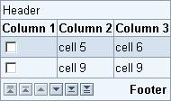

Figure 2: Table View with grid and patterned background (left) vs. transparent table
Cell Style
Individual cells can be given different styles as shown in figure 3; most of them are used for numeric values.
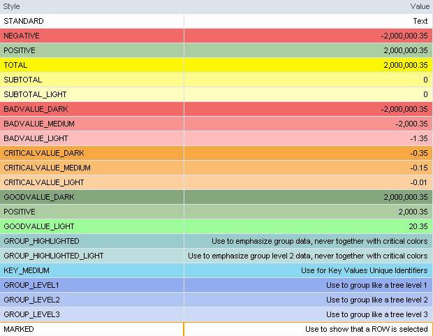
Figure 3: Example table showing different cell styles - click image for larger view
Note: The "GROUP_HIGHLIGHTED" colors should not be used in conjunction with the "CRITICALVALUE" colors.
Cell Content Types
Typically, table cells contain numeric or alphanumeric text. However, there are more cell types available:
· Text: Text cell - the text cannot be edited
· Image: Cell displays an icon or image
· Link: Cell contains a link (reference)
· Button: Cell contains a button
· Input: The cell can be edited
· User: The cell contains a dropdown list box
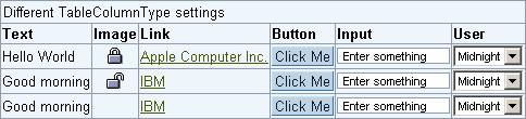
Figure 4: Example table showing different cell types
Design-relevant Attributes
The appearance and behavior of tables can be affected by various attributes.
· Header and Footer
The header text can be defined (headerText) and the header as well as the footer be hidden (Boolean attributes headerVisible, footerVisible).
Note: The footer must be visible if the table has to be scrolled, that is, if the table contains more lines than are visible.
· Size, Number of Lines, Initial Appearance
Another set of attributes determines the width of the table view (width), the number of visible rows (visibleRowCount), the first visible row (firstVisibleRow), and the initial appearance of empty rows (Boolean attribute fillUpEmptyRows).
· Selection Mode
Further attributes define how the table entries can be selected: single, multiple, or none (attribute selectionMode, values SINGLESELECT, MULTISELECT, or NONE ).
Note: The selection mode also influences the display of scroll buttons, provided the footer is set to visible.
For details see page Control API for Table View.
Related Controls
Tree View, Item List, List Box