
 CheckBoxGroup
The CheckBoxGroup enables the user to select one element from a set of options checking it. The UI element CheckBoxGroup arranges the individual CheckBoxes in single-column or two-column tables.

During the design time the properties accessibilityDescription and text are checked to ensure Accessibility.
The properties tooltip and label are not checked.
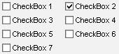
Examples of the Display
|
Single Column |
Two Column |
Three Column |
|
|
|
|


Runtime Class |
CL_WD_CHECKBOX_GROUP |
Properties in the View Designer
Name |
Type |
Initial Value |
Bindable |
ID |
STRING |
(automatic) |
No |
Text |
|
Yes |
|
I |
1 |
Yes |
|
WDY_BOOLEAN |
true |
Yes |
|
WDY_BOOLEAN |
false |
Yes |
|
Text |
|
mandatory |
|
WDUI_TEXT_DIRECTION |
inherit |
Yes |
|
Text |
|
Yes |
|
WDUI_VISIBILITY |
visible |
Yes |
|
STRING |
|
Yes |
Events in the View Designer
Name |
Further properties that can be inherited are defined in the associated higher-level class. The associated interface elements are:
Dynamic Programming
For dynamic programming the same properties, events, and aggregations are provided in the View Designer. Bear in mind the different spellings.
Dynamic Programming of Properties
View Designer Name |
Runtime Name |
Type |
ACCESSIBILITY_DESCR |
WDY_MD_TRANSLATABLE_TEXT |
|
COL_COUNT |
I |
|
ENABLED |
WDY_BOOLEAN |
|
READ_ONLY |
WDY_BOOLEAN |
|
STATE |
WDUI_STATE |
|
state: normal |
CL_WD_CHECKBOX_GROUP=>E_STATE-NORMAL |
|
state: required |
CL_WD_CHECKBOX_GROUP=>E_STATE-REQUIRED |
|
TEXTS |
WDY_MD_TRANSLATABLE_TEXT |
|
TEXT_DIRECTION |
WDUI_TEXT_DIRECTION |
|
textDirection: inherit |
CL_WD_CHECKBOX_GROUP=>E_TEXT_DIRECTION-INHERIT |
|
textDirection: ltr |
CL_WD_CHECKBOX_GROUP=>E_TEXT_DIRECTION-LTR |
|
textDirection: rtl |
CL_WD_CHECKBOX_GROUP=>E_TEXT_DIRECTION-RTL |
|
TOOLTIP |
WDY_MD_TRANSLATABLE_TEXT |
|
VISIBLE |
WDUI_VISIBILITY |
|
visible: none |
CL_WD_CHECKBOX_GROUP=>E_VISIBLE-NONE |
|
visible: visible |
CL_WD_CHECKBOX_GROUP=>E_VISIBLE-VISIBLE |
|
WIDTH |
STRING |
|
Dynamic Programming of Events
View Designer Name |
Runtime Name |
ON_TOGGLE |
Data Binding
A CheckBoxGroup is a multiple selection displayed as a group of checkboxes on the screen.
The view context must provide the node X that can contain 0 to n values (cardinality=0..n). The context node must contain an attribute y that provides the texts for the checkbox fields. The data type of the context attribute y can be any simple data type – for example, String, int, and so on. The number of checkboxes equals the number of node elements. The selection of the checkboxes is determined by the multiple selection of the node. The texts property of the CheckBoxGroup UI element is bound to the attribute y by assigning the context path of the context y to the texts property.
For more information about the structure of context structures see  Context. For
information about the data binding model see Data Binding and
Mapping, Data Binding and
Data Binding
of UI Element Properties.
Context. For
information about the data binding model see Data Binding and
Mapping, Data Binding and
Data Binding
of UI Element Properties.
Example
You can find examples of this interface element in the system in the Web Dynpro application WDR_TEST_UI_ELEMENTS, and in the component WDR_TEST_EVENTS in the view CheckboxGroup.