
 Table
Table

In a Web Dynpro table, data is displayed two-dimensionally in table cells arranged in rows and columns. Tables are scrollable.
The Web Dynpro table consists of the Table higher-level UI element and several view elements for table columns, TableColumn. The table contains properties that apply to the entire table, such as one to determine whether entries can be made in the table (readOnly=true). In comparison, the TableColumn contains properties that are valid only for column headings, properties valid for the whole column, and also other properties valid for cells whose values can vary for each row binding.
The column heading is implemented by the Header aggregation using a caption UI element. The second aggregation of TableColumn with the name TableCellEditor contains a UI element that is used to display the cells in the column. If the relevant UI elements are bound to readOnly attributes, data cannot be entered in them in the table.
The Table represents the elements of the context node bound to dataSource. All the properties of a TableCellEditor that are bound to an attribute of dataSource or to context nodes within the dataSource, do not assume the value of the lead selection of the node as is usual, instead they have the value of the selected row.
You can find information about the aspects that must be considered when setting the column width for the layout of a Table or TableColumn in SAP Note 1253282.

The use of the Table UI element in the TablePopin and RowRepeater UI elements is not supported.
Visualization
A Table consists of five horizontal and vertical areas:
● Table header
This aggregation (Insert Header) is optional.
● ToolBar
This aggregation (Insert Toolbar) is optional.
● Column headers/hierarchy of column headers (TableColumn header)
If the header is set to Caption.visibility=none for all columns (including hidden ones), the row with the column headers is hidden.
● Data rows with TableCellEditors (Insert Cell Editor)
The content of the data rows is determined by:
○ TableColumns
○ Table.visibleRowCount
○ Content of Table.dataSource
○ TableCellEditors
● Scroll bars
Scroll bars are displayed on the right-hand edge of each Table.
Example:

When you scroll through a table, a tooltip is displayed. You determine the texts for these scroll tips using the SCROLL_TIP_PROVIDER aggregation. If new data needs to be loaded, releasing the mouse triggers the round trip to the server.

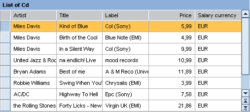
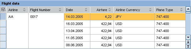
Example of a simple table with header, column headings, data rows and scroll bar:
In addition to these standard functions, a table can also contain more complex features:
● Selection and Selection Column
● Selection and hierarchy menu
● Master column hierarchies
● Popins (at cell and row levels)
● Header Group
● Row Grouping
● Column Scrolling
● Variants
● Column Sorting
● Totaling
Note that aggregation is available only for the SAP List Viewer Integration.
Selection and Selection Column
In addition to the columns defined by TableColumns, the table can also contain an selection column. This is controlled by the Table.selectionMode property.
Example of a selection column in a table:

In the case of readOnly tables (readOnly = true), you can select a row by clicking the row content. Note that the selection is not changed if you click a link, button, or the expand/collapse icons of the tree column.
Selection and Hierarchy Menu
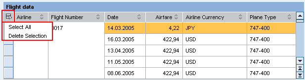
Tables can contain selection switches (table selection menu) in the top left corner.
● If multiple selection is possible in the table, (if selectionMode = multi or multiNoLead, or ifselectionMode=auto and dataSource has selection cardinality 0..n or 1..n), the user can select and deselect all lines using the menu. The lead selection remains with "Select all". If no lead selection is set, no lead selection can be set by "Select all". With "Deselect all" the lead selection is also deleted.
You can find an example in the system in ‘Selection’ in the WDR_TEST_TABLE component.
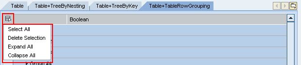
● If the table has aggregation TableRowArrangement of type TableRowGrouping, the user can also expand and collapse everything, in addition to selecting and deleting everything.
You can find an example in the system in RowGrouping in the WDR_TEST_TABLE component.
Examples of selection keys
The selection keys (table selection menu) for hierarchical tables (TreeByKeyTableColumn, TreeByNestingTableColumn) is not provided.
Hierarchy
Tables can also represent a hierarchy using the ROW_ARRANGEMENT aggregation (Insert RowArrangement).
There are two types of aggregation differentiated by the structure of the dataSource:
● TreeByKeyTableColumnsapurl_link_0003_0009_0126
The data source is a flat node, meaning that the hierarchy is displayed using the parent to key relationship.
● TreeByNestingTableColumnsapurl_link_0003_0010_0126
The data source is a recursive node whose subnodes contain lower-level elements.
Example of a RowArrangement in a table:
Popin
TablePopins display further information about a row or table cell directly beneath the row in question.
Example of a row popin in a table:

Header Group
If several rows or columns have the same header, rows and columns can be combined using the Insert Group Columns aggregation and a hierarchy can be created. There are two ways of doing this:
● Group columns (TableColumnGroup)
● Table columns (TableColumn)
For this purpose, the first three header lines are highlighted in color.
Example of a header grouping in a table:

Row Grouping
To combine the fields belonging to one column, the value TableColumn.groupingValue must be bound to the dataSource. The consecutive fields that have the same values for groupingValue and selectedCellVariant are merged into one field.
Example of a row grouping in a table:
The TableRowGrouping UI element can also be used to display grouped rows in a table.
Column Scrolling

We recommend that you do not insert too many columns into a table. If it is however still necessary to do so, horizontal scrolling in the browser window can be avoided by using column scrolling.
There are ways to implement column scrolling:
● Fixed number of visible columns
This mode is activated by specifying a fixed number of scrollable columns in the scrollableColumnCount property. The maximum number of columns specified is always displayed and a paginator is provided in the footer for scrolling.
● Columns that fit in the table
So that this mode functions reliably, a range of prerequisites must be met:
○ scrollableColumnCount = -2 activates the mode.
○ Furthermore fixedTableLayout=true should be activated so that columns are only displayed with the specified width.
○ The width specifications of all columns and of the table must be defined, and in the same unit too (exception: The table width can be in a different unit if the column widths are given as a percentage).
As many columns as fit in the table are displayed. If one of the columns is too wide, in the wrong unit of measure, or has no width specification, it is displayed separately in the full table width. Note that with an existing selection column, this column is added to the table, thus making the table wider than specified.
Variant
A variant is a list of alternative cells. It is created with the Insert Cell Variants aggregation. The TableStandardCell has its own TableCellEditor.

Note that of the three selection options only the TableStandardCell should be used for a table. The other two options are reserved for the ALV.
Column Sorting
You can define a table or the individual columns (TableColumn) as sortable. To do this the following conditions must be met:
● The table must be enabled (Table.enabled = TRUE)
● The table action OnSort must be activated (it must have an action handler)
● The TableColumn.sortstate attribute must be set to either none or down
Totaling
This function should not be used by application developers. Instead they should use the ALV functions.
You can use totaling to create subtotals and totals.
Example of totaling in a table:

Accessibility
To enable the development of accessible applications, the accessibilityDescription property is checked during the syntax check if the caption property is not set.
In addition a check is made to see whether the Header aggregation is set for columns and whether the aggregation header is visible.
The tooltip property is not checked.
When the WDLIGHTSPEED parameter is activated in accessibility mode, paginators are not used any more. The corresponding application parameters for the paginator and accessibility mode are ignored.
In accessibility mode you can navigate in the table using the cursor keys.
Table Details
Runtime Class |
CL_WD_TABLE |
Properties in the View Designer
Name |
Type |
Initial Value |
Bindable |
ID |
STRING |
(automatic) |
No |
Translatable text |
|
Yes |
|
WDY_BOOLEAN |
false |
No |
|
WDUI_CONTEXT_MENU_BEHAVIOUR |
inherit |
No |
|
WDY_MD_UI_ELEMENT_REFERENCE |
|
No |
|
Context node |
|
Mandatory |
|
WDUI_TABLE_DESIGN |
standard |
Yes |
|
WDY_BOOLEAN |
true |
Yes |
|
Translatable text |
|
Yes |
|
WDY_BOOLEAN |
true |
Yes |
|
I |
0 |
Yes |
|
I |
0 |
Yes |
|
STRING |
|
Yes |
|
WDY_BOOLEAN |
false |
Yes |
|
WDY_BOOLEAN |
true |
Yes |
|
WDUI_TABLE_GRID_MODE |
both |
Yes |
|
WDY_BOOLEAN |
false |
No |
|
WDY_MD_UI_ELEMENT_REFERENCE |
|
Yes |
|
WDY_BOOLEAN |
false |
Yes |
|
WDY_BOOLEAN |
false |
Yes |
|
I |
-1 |
Yes |
|
WDY_BOOLEAN |
true |
Yes |
|
I |
-1 |
Yes |
|
STRING |
|
Yes |
|
WDUI_TABLE_SEL_CHNG_BEHVR |
auto |
No |
|
WDUI_TSMODE |
auto |
Yes |
|
Translatable text |
|
Yes |
|
WDUI_VISIBILITY |
visible |
Yes |
|
I |
5 |
Yes |
|
STRING |
|
Yes |
Aggregations in the View Designer
Name |
Cardinality |
Type |
0..n |
||
0..1 |
||
0..1 |
||
0..n |
||
0..1 |
||
0..1 |
||
0..1 |
||
0..1 |
||
0..1 |
TableRowArrangement |
|
0..1 |
||
0..1 |
Events in the View Designer
Name |
Other properties that can be inherited are defined in the associated higher-level classes. The associated UI elements are:
Data Binding
A table receives its data from a context node – that is, the dataSource table property must be bound to a multiple context node.
At runtime, each node element of the node collection is a row.
The number of rows is identical to the number of node elements. The selected rows correspond to the node selection. If the selection of the context node changes, the selected rows also change.
The columns correspond to the context attributes and are described by the aggregation of TableColumn objects. They specify the number and order of columns as well as the headers and the width of the columns.
The content of a cell to be displayed is specified by the table cell editor (TableCellEditor) of the column. The table cell editor can only display the content in a cell, so it does not make any difference if the content cannot be edited. The following table cell editors can be selected:
● Button, LinkToAction, LinkToURL:
UI elements that can be used to trigger events. We recommend that you do not use Button in the table due to its problematic design.
● Caption, Image, ProgressIndicator, TextView:
UI elements that can be used to display texts or graphics.
Note that if the texts are too long they are wrapped in TextView and this can spoil the layout of the table. To prevent this use the fixed table layout mode of the table and set wrapping=false in TextView.
● CheckBox, RadioButton, DropDownByKey:
UI elements that can be used to select elements of a specific value set.
● DropDownByIndex
● InputField:
This UI elements enables cell contents to be edited.
The content to be displayed in a table does not have to be identical to the data source of the table. For example, two columns can display the same context attribute or two context attributes can be displayed in the same column.
Dynamic Programming
For dynamic programming, the same properties, events, and aggregations as in the View Designer are available. Bear in mind the different spellings.
Dynamic Programming of Properties
View Designer Name |
Runtime Name |
Type |
ACCESSIBILITY_DESCR |
WDY_MD_TRANSLATABLE_TEXT |
|
ACTIVATE_ACCESS_KEY |
WDY_BOOLEAN |
|
CONTEXT_MENU_BEHAVIOUR |
WDUI_CONTEXT_MENU_BEHAVIOUR |
|
contextMenuBehaviour: inherit |
CL_WD_TABLE=>E_CONTEXT_MENU_BEHAVIOUR-INHERIT |
|
contextMenuBehaviour: provide |
CL_WD_TABLE=>E_CONTEXT_MENU_BEHAVIOUR-PROVIDE |
|
contextMenuBehaviour: suppress |
CL_WD_TABLE=>E_CONTEXT_MENU_BEHAVIOUR-SUPPRESS |
|
CONTEXT_MENU_ID |
WDY_MD_UI_ELEMENT_REFERENCE |
|
DATA_SOURCE |
OBJECT |
|
DESIGN |
WDUI_TABLE_DESIGN |
|
design: alternating |
CL_WD_TABLE=>E_DESIGN-ALTERNATING |
|
design: standard |
CL_WD_TABLE=>E_DESIGN-STANDARD |
|
design: transparent |
CL_WD_TABLE=>E_DESIGN-TRANSPARENT |
|
design: transparentWithGrid |
CL_WD_TABLE=>E_DESIGN-TRANSPARENT_WITH_GRID |
|
DISPLAY_EMPTY_ROWS |
WDY_BOOLEAN |
|
EMPTY_TABLE_TEXT |
WDY_MD_TRANSLATABLE_TEXT |
|
ENABLED |
WDY_BOOLEAN |
|
FIRST_ACTUAL_ROW |
I |
|
FIRST_VISIBLE_ROW |
I |
|
FIRST_VISIBLE_SCROLL_COL |
STRING |
|
FIXED_TABLE_LAYOUT |
WDY_BOOLEAN |
|
FOOTER_VISIBLE |
WDY_BOOLEAN |
|
GRID_MODE |
WDUI_TABLE_GRID_MODE |
|
gridMode: both |
CL_WD_TABLE=>E_GRID_MODE-BOTH |
|
gridMode: horizontal |
CL_WD_TABLE=>E_GRID_MODE-HORIZONTAL |
|
gridMode: none |
CL_WD_TABLE=>E_GRID_MODE-NONE |
|
gridMode: vertical |
CL_WD_TABLE=>E_GRID_MODE-VERTICAL |
|
HANDLE_HOTKEYS |
WDY_BOOLEAN |
|
LEGEND_ID |
WDY_MD_UI_ELEMENT_REFERENCE |
|
MULTI_COL_SORTING |
WDY_BOOLEAN |
|
READ_ONLY |
WDY_BOOLEAN |
|
ROW_COUNT |
I |
|
ROW_SELECTABLE |
WDY_BOOLEAN |
|
SCROLLABLE_COL_COUNT |
I |
|
SELECTED_POPIN |
STRING |
|
SELECTION_CHANGE_BEHAVIOUR |
WDUI_TABLE_SEL_CHNG_BEHVR |
|
selectionChangeBehaviour: auto |
CL_WD_TABLE=>E_SELECTION_CHANGE_BEHAVIOUR-AUTO |
|
selectionChangeBehaviour: ifNoLoss |
CL_WD_TABLE=>E_SELECTION_CHANGE_BEHAVIOUR-IF_NO_LOSS |
|
selectionChangeBehaviour: manual |
CL_WD_TABLE=>E_SELECTION_CHANGE_BEHAVIOUR-MANUAL |
|
SELECTION_MODE |
WDUI_TSMODE |
|
selectionMode: auto |
CL_WD_TABLE=>E_SELECTION_MODE-AUTO |
|
selectionMode: multi |
CL_WD_TABLE=>E_SELECTION_MODE-MULTI |
|
selectionMode: multiNoLead |
CL_WD_TABLE=>E_SELECTION_MODE-MULTI_NO_LEAD |
|
selectionMode: none |
CL_WD_TABLE=>E_SELECTION_MODE-NONE |
|
selectionMode: single |
CL_WD_TABLE=>E_SELECTION_MODE-SINGLE |
|
selectionMode: singleNoLead |
CL_WD_TABLE=>E_SELECTION_MODE-SINGLE_NO_LEAD |
|
TOOLTIP |
WDY_MD_TRANSLATABLE_TEXT |
|
VISIBLE |
WDUI_VISIBILITY |
|
visible: none |
CL_WD_TABLE=>E_VISIBLE-NONE |
|
visible: visible |
CL_WD_TABLE=>E_VISIBLE-VISIBLE |
|
VISIBLE_ROW_COUNT |
I |
|
WIDTH |
STRING |
|
Dynamic Programming of Events
View Designer Name |
Runtime Name |
ON_COL_SELECT |
|
ON_DROP |
|
ON_FILTER |
|
ON_LEAD_SELECT |
|
ON_SCROLL |
|
ON_SELECT |
|
ON_SORT |
Dynamic Programming of Aggregations
View Designer Name |
Runtime Name |
Cardinality |
COLUMNS |
0..n |
|
DRAG_SOURCE_INFO |
0..1 |
|
DROP_TARGET_INFO |
0..1 |
|
GROUPED_COLUMNS |
0..n |
|
HEADER |
0..1 |
|
LEGEND_POPIN |
0..1 |
|
MASTER_COLUMN |
0..1 |
|
POPIN |
0..1 |
|
ROW_ARRANGEMENT |
0..1 |
|
SCROLL_TIP_PROVIDER |
0..1 |
|
TOOLBAR |
0..1 |
Example
You can find examples of this interface element in the system in the WDR_TEST_UI_ELEMENT Web Dynpro application, in the Table view in the WDR_TEST_EVENTS component, and in the WDR_TEST_TABLE and DEMO_TABLE components.