
 Table Properties

Properties in the View Designer
● accessibilityDescription
Once you have activated accessibility, the assigned text is added to the quick info. This description provides semantic details of the UI element and is only read by the screen reader if the user focuses the complete Ul element.
This property can be personalized by an administrator.
● activateAccessKey
Activation of access keys.
This property can be personalized both by a user and by an administrator.
● dataSource
Context node
with data for the table
Primary
Property
● design
Table display

The color of tablecolumn.design is only displayed if table.design<>alternating.
This property can be personalized by an administrator.
Value |
Visual Display |
Description |
alternating |
|
White/grey alternative rows, only possible with readOnly |
standard |
|
Standard table background: The table background has one color. The individual cells are displayed with gridlines. |
transparent |
|
The table background is transparent. The individual cells are displayed without grid net lines. |
transparentWithGrid |
|
The table background is transparent. The individual cells are displayed with grid net lines. |
● displayEmptyRows
This property checks whether empty rows in the area can be displayed for visible rows. If you set this property to false, the visible rows are collapsed in such a way that the actual number of rows with content is displayed.
Examples:
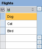
Number of elements = 3 visibleRowCount = 5 displayEmptyRows = true (default) |
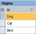
Number of elements = 3 visibleRowCount = 5 displayEmptyRows = false |
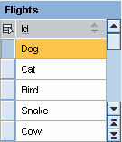
Number of elements = 20 visibleRowCount = 5 displayEmptyRows = false |
|
|
|
● emptyTableText
Text displayed for an empty table.
This property can be personalized by an administrator.
● firstActualRow

This property is deprecated. See Data Segments in the Context
Row of the table (counted from 0) that corresponds to the first element in the context. This property is used if you want the context to contain only one pane from the table.
Use this property only for tables with extremely large data volumes.

This is not permitted for TreeByKeyTableColumn and TreeByNestingTableColumn.
● firstVisibleRow
First visible row of the table (counted from 0).
If the firstVisibleRow lies outside of the existing data records, then the first visible row is recalculated internally so that as many rows as possible are visible at the end of the data set. The value however is not written back to the UI element. If the row is actually available in the data records, but the following data records are not sufficient to fill all the rows, empty rows are displayed for the missing data records. The first visible row is not corrected in this case.
This property, which does not have to be bound, can be changed by the client. More information: Properties Used in MultiPane or TablePopin.
● firstVisibleScrollableCol
First visible scrollable column of the table (ViewElement ID)
This property, which does not have to be bound, can be changed by the client. More information: Properties Used in MultiPane or TablePopin.
● fixedTableLayout
With fixedTableLayout each table column is precisely as wide as specified. If the content is larger it is cut off on the right. Without fixedTableLayout a column is as wide as specified or as wide as the widest TableCellEditor.
If you use scrollableColCount=-2, fixedTableLayout should be set.
This property can be personalized by an administrator.
More information: SAP Note 1253282
● footerVisible
This property is presently not evaluated.
● gridMode
Grid mode.
This property can be personalized by an administrator.
Value |
Description |
both |
Horizontal and vertical lines are displayed |
horizontal |
Horizontal lines are displayed |
none |
The table has no grid lines |
vertical |
Vertical lines are displayed |
● handleHotkeys
Specifies whether hot keys defined within the UI element can be triggered globally or locally (when the focus is in the UI element).
● legendId
ID of the assigned Legend
● multiColSorting
Activates the ability to sort multiple columns (example: WDR_TEST_TABLE, CELL_POPIN).
By pressing CTRL and clicking on the appropriate columns, you can select multiple columns to sort.
● readOnly
The table differentiates between editable mode and read-only mode. In the editable mode (readOnly=false) input-enabled cells are shown with white a background, and cells not input-enabled are shown with a grayed-out background. Cells are input-enabled when the table enabled is, the TableCellEditor in this table is input-enabled and is not readOnly.
In readOnly mode all cells are not input-enabled. But they are not grayed-out. You can also use semantic colors (TableColumn.cellDesign) and an alternating background (Table.design=alternating).
InputFields, DropDownByIndex and DropDownByKey are displayed as text. No value list is provided.
CheckBox and RadioButton are readOnly.
table.design=alternating only has an effect if readonly=X.
This property can be personalized
by an administrator.
In personalization, this property can be assigned the value true.
● rowCount
This property is deprecated. See Data Segments in the Context
Number of rows displayed in the table (for context paging only).
You cannot set the rowCount at the same time as you insert a TreeByNestingTableColumn or a TreeByKeyTableColumn.
● rowSelectable
The rowSelectable property enables you to make specific table rows selectable or non-selectable. For example, in WDA ALV totals rows for results and intermediate results cannot be selected since they do not correspond to any data, and the status of these rows can be changed to non-selectable using the rowSelectable property.
However, you should not set the rowSelectable value to false without context binding. If you want to deactivate the selection completely, set the selectionMode to none.
● scrollableColCount
Number of scrollable columns that can be displayed at the same time.
Possible Values |
Description |
Values smaller than -1 |
Not permitted |
-1 |
Columns are displayed. No column scrolling |
0 |
Columns are not displayed. Neither are TableColumn headers displayed, and the following message appears: The table does not contain any visible columns. |
Values larger than 0 |
A scroll bar for column scrolling appears and the specified number of columns is displayed. |
This property can be personalized by an administrator.
● selectedPopin
TablePopin
currently visible.
ID of the row of visible popins: Either the ID of the TablePopin ort he ID of
a column popin. Leave this property empty if you do not want to display a
popin.
● selectionChangeBehaviour
The lead selection in the context can be toggled by the user either automatically or manually, that is, by the application itself.
This function only takes effect if the lead selection is set or removed by the user.
Value |
Description |
auto |
Lead selection is toggled automatically |
manual |
The lead selection is not set by the framework. The application developer can set the lead selection in the event handler of onLeadSelect. |
ifNoLoss |
For future enhancements |
● selectionMode
Specifies how selections are made in the table.
If you click on a selection cell, a row is selected. The lead selection (except with singleNoLead and multiNoLead) is set to the associated element. If other selections exist, they are deleted.
In modes, multi, multiNoLead and auto with node cardinality 0..n or 1..n, the following is possible:
○ CTRL+click, CTRL+spacebar
Toggles a selection.
○ SHIFT+click, CTRL+shift
Selects the area from the lead selection to the row selected. If no lead selection is set, the selection starts from the first row. In the multiNoLead mode, the selection starts from the row last selected
Value |
Description |
auto |
Lead selection and single selection or multi-selection, if the context node permits this |
single |
Lead selection and single selection |
multi |
Lead selection and multiple selection |
none |
No selection |
singleNoLead |
Single selection (without lead selection) |
multiNoLead |
Multiple selection (without lead selection) |
● visibleRowCount
Number of rows visible at once in the table.
If the number of rows in the dataSource is smaller than the visibleRowCount, the table is filled with empty rows. These rows are not input-enabled.
Table.visibleRowCount = -1 is deprecated.
With -1 all rows from the dataSource are displayed at once and no paginator is displayed. This can, however, lead to a reduction in performance on the client side. So instead use Table.displayEmptyRows=false combined with Table.visibleRowCount>0. In addition you must specify the maximum number of visible rows for your application interfaces.
This property can be personalized both by a user and by an administrator.
A large number of visible entries (for instance more than 30) can lead to performance problems. Use the integrated paging or scrolling options of the associated UI element.
● width
Width of the table. The table is at least as big as the specification here, at any rate big enough that the content fits in the table. For this reason we recommend you specify a width only if a percentage value is used for the column width.
This property can be personalized by an administrator.