
 Developing the Form View
In this section, we will first list the declarative and visual development parts of the Form view and its controller. The description of the components is limited to the basic information items involved.
Controller Context of the View
In the controller context of the Form view, you require three value attributes for Name, Birthday and E-Mail Address for the form data. Declare these in the appropriate Context tab.
Controller Context of the Form View |
|||
Context Element |
Type |
Property |
Value |
|
Value Attribute |
type |
Name
Simple Type defined previously in the Java Dictionary stored in the DataDictionary package with the name com.sap.tc.webdynpro.tutorial. errorbehavior.datatypes |
|
Value Attribute |
type |
Birthday
Simple type in the Java Dictionary |
|
Value Attribute |
type |
string |


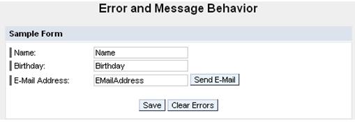
Layout of the View and Data Binding
The
following table lists the structure of the UI elements contained in the layout
of the Form view. The context paths
are also specified for included properties of UI elements. Properties linked
to the value attributes are marked by the symbol  in
front of the path specification for the value attribute.
in
front of the path specification for the value attribute.

When designing the view layout according to the following table, note that the labelFor property for UI elements of type Label can only be selected if the subsequent InputField UI element has been added.
Layout of the Form View |
|
|
|
Property |
Value |
Container RootUIElementContainer of type TransparentContainer |
|
Properties of Transparent Container - layout |
GridLayout |
Layout – colCount |
1 |
Text HeaderText of type TextView in UI element RootUIElementContainer |
|
Properties of TextView – design |
header1 |
Properties of TextView – text |
Error and Message Behavior |
LayoutData – hAlign |
Center |
LayouData – paddingBottom |
Large |
Group FormGroup of type Group in UI element RootUIElementContainer |
|
Properties of Group - design |
Sapcolor |
Properties of Group - layout |
GridLayout |
Properties of Group – width |
75% |
Layout – colCount |
2 |
LayoutData – hAlign |
center |
Caption FormGroup_header of type Caption in UI element FormGroup |
|
Properties of Caption – text |
Sample Form |
Label NameLabel of type Label in UI element FormGroup |
|
Properties of Label – labelFor |
NameInput |
Properties of Label – text |
Name: |
LayoutData – width |
25% |
Input field NameInput of type InputField in UI element FormGroup |
|
Properties of InputField – state |
Required |
Properties of InputField – value |
|
Label BirthdayLabel of type Label in UI element FormGroup |
|
Properties of Label – labelFor |
BirthdayInput |
Properties of Label – text |
Birthday: |
Input field BirthdayInput of type InputField in UI element FormGroup |
|
Properties of InputField – value |
|
Label EmailAddressLabel of type Label in UI element FormGroup |
|
Properties of Label – labelFor |
EmailAddress Input |
Properties of Label – text |
E-Mail Address: |
Container EMailContainer of type TransparentContainer in UI element FormGroup |
|
Input field EMailAddressInput of type InputField in UI element EMailContainer |
|
Properties of InputField – value |
|
Pushbutton SendEMailButton of type Button in UI element EMailContainer |
|
LayoutData – paddingLeft |
Small |
Container ButtonContainer of type TransparentContainer in UI element FormGroup |
|
LayoutData – colSpan |
2 |
LayoutData – hAlign |
center |
LayoutData – paddingTop |
large |
Pushbutton SaveButton of type Button in UI element ButtonContainer |
|
Pushbutton ClearButton of type Button in UI element ButtonContainer |
|
LayoutData – paddingLeft |
small |
Container ButtonContainer of type TransparentContainer in UI element RootUIElementContainer |
|
Properties of TransparentContainer – width |
75% |
Layout – colCount |
2 |
Container MessageTranspContainer of type TransparentContainer in UI element RootUIElementContainer |
|
Properties of TransparentContainer – width |
75% |
Properties of TransparentContainer - layout |
GridLayout |
LayoutData – paddingTop |
Medium |
Message area MessageArea of type MessageArea in UI element MessageTransparentContainer |
|
Use UI element MessageArea to define position of the messages output by Message Manager. If you do not do this, the default position for all message texts is the final position in the view layout.
Actions and Binding Events
In the view controller, define the listed actions and link the corresponding events of UI elements to these actions.
Controller Context of the Form View |
|||
Name of the Action |
Text |
Without validation |
Event Handler |
Clear |
Clear Errors |
|
onActionClear |
Save |
Save |
|
onActionSave |
SendEMail |
Send E-Mail |
|
onActionSendEMail |


Here, the Clear action is declared as a non-validating action. This ensures that no data entered by the user is validated until this data is stored in the context. This makes it possible to delete the entries in the input fields linked to the individual value attributes, or to reset them to the values defined originally, even if these are not valid – that is, if validation has failed.
Afterwards, the events in individual UI elements can be linked to the previously defined actions..
Binding Events to Actions in the Form View |
||
UI Element Name |
Event Name |
Action |
SendEMailButton |
onAction |
SendEMail |
SaveButton |
onAction |
Save |
ClearButton |
onAction |
Clear |
 Now repeat the above
procedure in the EmailEditor
View.
Now repeat the above
procedure in the EmailEditor
View.