
Status Display (Control Element)
Status displays are icons which indicate the state of an object or a value.
Illustration
Status display
Use
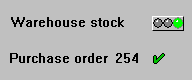
You can use icons to indicate a status (processing state of an object). For example, you can implement the status display of a table entry (checked, erroneous) by using a two-value display. Another example is the in-box in the mail system: if a message has been viewed, a checkmark could appear next to the message (implicit two-value display). More complex, three-value displays are also possible.
With digital status displays we distinguish the following cases:
Appearance
With generic meanings we distinguish the following status displays:
One pictorial representation: checkmark. Meaning: for example, "okay", "done" or "viewed".
Two pictorial representations: checkmark and cross. Meaning: "yes" and "no", "done" and "to do", "okay" and "not okay" etc.
Two pictorial representations: Plus and minus signs. Meaning: "positive" and "negative"
Two pictorial representations: Lock open or closed. Meaning: "locked" und "not locked"
Pictorial representation: Traffic lights red - yellow - green. Meaning: "negative", "neutral" and "positive"
Pictorial representation: Checkmark - cross - lightning. Meaning: "okay", "open", "failure"
|
CHECKED |
Checked |
Icons as status display: implicitly two-state
|
CHECKED |
Yes |
|
INCOMPLETE |
No |
|
LOCKED |
Locked |
|
UNLOCKED |
Unlocked |
|
POSITIVE |
Positive |
|
NEGATIVE |
Negative |
Icons as status display: two-state (icons in rows belong together)
|
CHECKED |
Checked |
|
GREEN_LIGHT |
Positive |
|
INCOMPLETE |
Incomplete |
|
YELLOW_LIGHT |
Neutral |
|
FAILURE |
Failure |
|
RED_LIGHT |
Negative |
Icons as status display: three-state (icons in columns belong together)
Icons for status displays
Design
Place status displays always close to the corresponding control elements.
With field names, checkboxes etc. the status displays is always positioned to the right of the corresponding control element.
Arrangement in Tables

In general, you have to define a context-specific and translatable quickinfo text.
Technical Notes
Status icons are defined as templates, that is, they should have a height of one line and a width of two characters (traffic lights four characters). In the graphical Screen Painter there is a special object for status displays in the toolbar.
Cross-References


