Usage & Type
The tree view control is used to display hierarchical data or text. The hierarchy levels may be expanded and collapsed. Every tree node contains a text and an arrow icon that expands and collapses the node. If a node has no child elements in the hierarchy, there is no arrow icon. The node text might also link to a function that displays the connected data.
The first four levels have different colors. From the 5th level on the color stays the same like in the 4th level.
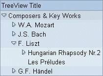
Figure 1: Example of a tree with three levels
Usage
Trees contain complex information and are cumbersome to use. If possible, do not use trees and consider other alternatives, especially in iViews. Trees with hierarchies more than 2-3 levels deep should be avoided altogether!
How to Avoid Trees
If the number of tree elements is small, hierarchies can be flattened to lists, and the items may follow some other ordering like by alphabet or relevance.
Consider using dropdown list boxes , the shuffler (filter) or tabstrips in combination with tables in order to select partial data sets. This leads to a far less complex user interface than large trees that have to be scrolled or paged through.
Design-relevant Attributes
The tree view control does not have a width attribute. To set the width, place the tree inside a grid layout control.
Use attribute title to set a title for the tree.
For tree items, the item text and a corresponding tooltip text can be defined (attributes text and tooltip).
Related Controls
Item List , Dropdown List Box , Table View , Tabstrip , Grid Layout (for sizing)