Creating Tables
A Table basically consists of columns (sap.m.Column) and rows. The rows, defines as sap.m.ColumnListItems consist of cells.
Procedure
- To build a Table, you have to define table rows. For this purpose you use
ColumnListItems. ColumnListItems have a
cell aggregation (one to many) which defines cells in one row according to the
column definition. Let's build a real table example to understand it better.
Here is the implementation:
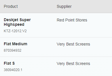
<Table <columns> <Column width="12em"> <Text text="Product" /> </Column> <Column minScreenWidth="Tablet" demandPopin="true"> <Text text="Supplier" /> </Column> </columns> <items> <ColumnListItem> <cells> <ObjectIdentifier title="{Name}" text="{ProductId}" class="sapMTableContentMargin" /> <Text text="{SupplierName}" /> </cells> </ColumnListItem> </items> </Table>And that is what we have built:
The mergeFunctionName property holds the function that the column merge functionality uses to pull the property value to compare for duplicates. The default of getText can be used for the most common use cases, where an sap.m.Label or sap.m.Text control is used, but if you have another control with a different function to pull the comparison property value from, you can specify it as the mergeFunctionName. For example, the sap.m.Icon control has a getSrc getter function that returns the src property value - the icon's URI, which is a good candidate for comparison.