
 Property Editor

Use
You use this user interface pattern to manage data contained inside an aspect row of an entity service. The Property Editor is a UI component pattern which can be embedded into any page pattern such as the Navigation pattern. You use the Property Editor pattern to build label and input control pairs.
Features
The Property Editor pattern consists of the following parts:
● Property Editor Configurator
● Property Editor UI layout
Property Editor Configurator
The main toolbar of this application consists of set of controls used to managed the Property Editor’s configurations. With these configurator controls, you can create new (New) or open existing configurations (Open), save currently opened configurations (Save), or save them under a new name (Save as). You can also delete currently opened configurations (Delete) or review the results of your configuration in a new screen (Preview).
By creating a new configuration, you specify the component’s physical and logical data sources and presentation properties seen in the Property Editor user interface. The Property Editor Configurator uses the following tab pages to define how the pattern is displayed:
● Data Source
● Logical Fields
● Presentation
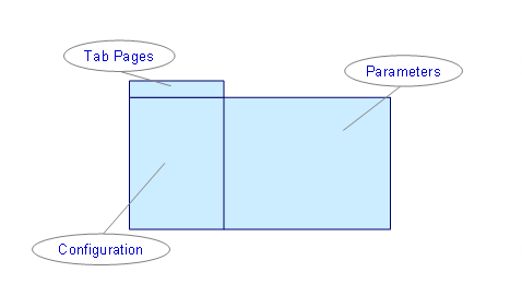
The figure below displays the different areas in the Property Editor configuration screen.
Data Source Tab Page
On this tab page, you specify if the component’s data source is selected from either a query with a set of parameters or as relations to an aspect row. The aspect row is specified by embedding the component at runtime.
In the configuration section of the Property Editor layout (see the figure Property Editor Pattern Screen Layout above), you provide configuration information about the service model, query, and result aspect that will be used in the new configuration.
You define the development component and ESF (Enterprise Service Framework) parameters in the repository browser which appears after selecting the ESF query. The repository browser appears as a dialog box and is divided into the following parts:
● Service Modules
Lists the service modules available for implementation in the application. Each module contains aspects and queries associated with the service module.
● Queries
The list is populated depending on the service module chosen. The query name consists of the operations command and attribute used in the query.
● Aspects
Lists the set of logically grouped fields targeted in a query.
Logical Fields Tab Page
The logical field is an invisible element that is used in conjunction with the presentation layer element to embed data types such as string, integer, or Boolean. Each logical field contains an expression and the result type of an expression. It can be used to obtain constant variables and cast expressions according to type. The logical field also includes the result of the calculated expression.
Similar to the FlexTree and History Log Patterns, you can use the macro language to calculate values via the embedded macro editor. There is a predefined set of macro functions such as @switch, @format, @substring @component_mime, or @app_mime. You can check your macro syntax by using the check macro function.
For more information on the macro language used in creating UI patterns, see Macros.
Presentation Tab Page
With this tab page, you specify information on how control pairs are displayed. It includes the most comprehensive configuration part of the application for defining:
● Window properties
● Row properties
You create the runtime layout of the Property Editor pattern with this tab page. The figure below shows how the screen layout is divided.
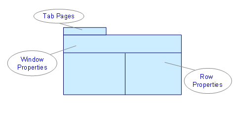
Window Properties
You can manage and configure the header properties of the Property Editor pattern such as width, height, and number of columns with the window properties section of the configurator.

Only visible rows are displayed, hence only they can be arranged.
The Property Editor can be displayed using the following styles:
● Transparent
This style provides no background inside the Property Editor window and rows.
● Classic
This design uses a contrast scheme for the editor rows, where label areas are selected from the header, yet the input control areas remain transparent.
● Alternating
This style provides a full alternative visual style where each row has a different background with different coloring.
Property Editor User Interface
In the user interface, you can see the results of the pattern configuration. The UI contains the name of the pattern you have created, together with the configured fields for entering a title and description.