Class 2 Chart Types

Chart Types
Scatter charts, time scatter charts, histogram charts, and heatmaps all belong to class 2.
Structure of the Data Provider
You build the table on which a chart type of class 2 is based as follows:
● The first data row contains the values to be entered on the X axis.
● The remaining data rows contain the Y values. These data rows are converted into data series. The number of data series in the chart is the total number of data rows minus 1.
The X value of a data point is always from the first data row. The Y value of a data point is from one of the remaining data rows, depending on the data series to which the data point belongs.

Data providers for histograms and heatmaps need a special structure, which is described in the corresponding sections.
Scatter Chart
In a scatter chart, either the relationship between numeric values is displayed in several data series or two groups of numbers are entered as a row of XY coordinates. This chart type displays irregular intervals (clusters) and is normally used for scientific data.
Both axes of a scatter chart are value axes. In other chart types, the X axis is used to display categories.
Data Provider

If you are using a Web template in SAP BW 3.x format, choose Change Drilldown → Swap Axes from the context menu.
Chart
Special Features
You can fill the areas between two points of a data series, almost as if the chart were an area chart. To do so, choose Scatter → Filled.
Time Scatter Chart
The time scatter chart is similar to a scatter chart. The x value can be a date or time.
Data Provider
If you are using a Web template in SAP BW 3.x format, choose Change Drilldown → Swap Axes from the context menu.
Chart

Special Features
You can create a time scatter chart with date or time values.
You can set up to three different time axes; for example, one for years, one for quarters, and one for months. To do this, choose Time Axis → Line → Line Type1 to Line Type3.
You can use Line Format1 to Line Format3 to specify the format in which the time specifications are to be displayed. You can use the properties Line Step1 to Line Step3 to set the intervals between time units. The following abbreviations are used for the time specifications:
D = day, M = month, Y = year, W = week, Q = quarter, h = hour, m = minute, s = second.
Examples of Time Axis Formats
Time |
Syntax |
Result |
23. August 2004 |
DD. MMM YYYY |
23. Aug 2004 |
23. August 2004 |
MM-DD-YYYY |
08-23-2004 |
23. August 2004 |
DDD MMM YY |
Mon Aug 04 |
23. August 2004 |
MMM W |
Aug 35 |
23. August 2004 |
W YY |
35 04 |
23. August 2004 |
Q.YY |
3.04 |
23. August 2004 |
D |
23 |
23. August 2004 |
DD |
23 |
23. August 2004 |
DDD |
Mon |
23. August 2004 |
DDDD |
Monday |
23. August 2004 |
M |
8 |
23. August 2004 |
MM |
08 |
23. August 2004 |
MMM |
Aug |
23. August 2004 |
MMMM |
August |
23. August 2004 |
Q |
3 |
12:34:00 |
hh:mm:ss |
12:34:00 |
12:34:00 |
hh:mm |
12:34 |
You can fill the area beneath a data series by choosing Time Scatter → Filled.
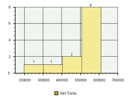
Histogram
The frequency of a characteristic is displayed in a histogram (for example, the sales revenue for a product group). The frequencies are divided into classes, where each class corresponds to a column in the histogram.
In a histogram, categories (classes) are entered on the X axis and the number of corresponding values are entered on the Y axis.
Data Provider
Chart
Special Feature
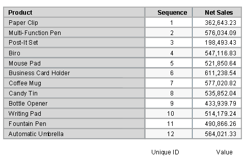
To be displayed correctly, a histogram needs one data source with exactly the structure shown above. The first data column contains unique numeric values only; these do not need to be sorted. The second data column contains the values that are sorted into the classes of the histogram.
You can control the number of classes by choosing Histogram → Classes → <required number of classes>.
More information:
Adding, Changing, and Removing Trend Lines
Heatmap
Heatmaps allow you to display large volumes of data compactly in a diagram. You can display the values of two key figures compactly and independently of each other for a number of data series. The display is two dimensional:
...
1. Area (rectangle size)
This records the values of the first key figure (such as Billed Quantity).
2. Color (position in color ramp)
This records the values of the second key figure (such as Net Sales).
You can thus identify unusual values and trends easily and answer business questions such as "How do the sales figures in various distribution channels and product groups compare to each other?".
Data Provider
You build the table on which a heatmap is based as follows:
● The table must contain exactly two characteristics (such as Distribution Channel and Product Group). The first characteristic (Distribution Channel) can have up to 100 characteristic values (such as EDI, Fax), and thus determines the number of data series. The second characteristic (Product Group) can have various characteristic values (such as Bad & Outdoor, Accessories), and thus determines the number of categories for each data series.
● The table must contain exactly two key figures (data columns) for each category.

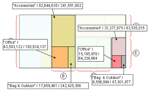
Chart (with Explanation)
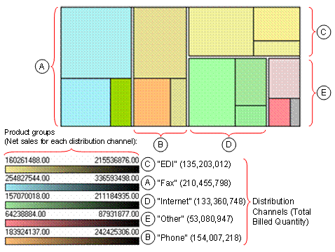
Dimension Area: The characteristic value Fax (Distribution Channel characteristic) results in the large square to the upper left of the heatmap, since its categories (Product Groups) have the largest Billed Quantity. The three categories are within this rectangle; each is represented as a rectangle proportional to their Billed Quantity.
Dimension Color: The three product groups Bag & Outdoor, Accessories and Office are differentiated by color based on the Net Sales for each Distribution Channel. For the Distribution Channel, the colors for the Bag & Outdoor and Accessories rectangles are similar, whereas the Office category, on the other hand, is easy to distinguish (compare to data provider).
Using the following figure, you can see how the two display dimensions, area and color, behave in the heatmap. To illustrate the example more clearly, two data series, (the distribution channels Phone and Others), have been highlighted visually. The text fields are structured as follows: Category / Billed Quantity for Distribution Channel/Net Sales for Distribution Channel.