
 Group
Group

The Group UI element is a UI element container and can be used to group multiple UI elements under one common title. The UI element looks like a display panel with a colored background.
The enabled property has no effect on the UI element children you inserted into the UIElementContainer. If, for example, you set the enabled property to false in the group UI element, an input field inserted in it is not automatically deactivated. If the UI element children in this group UI element are also to be deactivated, you must set the relevant property for each UI element separately.
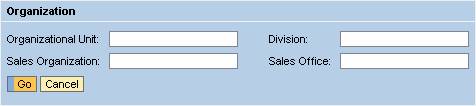
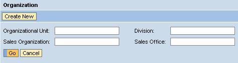
Examples of the Display
Group with Primary Color
Group with Secondary Color and Tool Bar
Group with sapcolor
|

To enable the development of accessible applications, the accessibilityDescription property is checked during the syntax check if the caption property is not set.
The tooltip property is not checked.
A tooltip does not necessarily have to be set for this UI element, but it could make sense to set it if it contains detailed semantic information.
Runtime Class |
CL_WD_GROUP |
Properties in the View Designer
Name |
Type |
Initial Value |
Bindable |
STRING |
(automatic) |
No |
|
Translatable text |
|
Yes |
|
WDY_BOOLEAN |
false |
No |
|
WDUI_CONTEXT_MENU_BEHAVIOUR |
inherit |
No |
|
WDY_MD_UI_ELEMENT_REFERENCE |
|
No |
|
WDY_MD_UI_ELEMENT_REFERENCE |
|
Yes |
|
WDUI_GROUP_DESIGN |
primarycolor |
Yes |
|
WDY_BOOLEAN |
true |
Yes |
|
WDY_BOOLEAN |
false |
No |
|
WDY_BOOLEAN |
true |
Yes |
|
STRING |
|
Yes |
|
WDUI_SCROLLING_MODE |
none |
Yes |
|
Translatable text |
|
Yes |
|
WDUI_VISIBILITY |
visible |
Yes |
|
STRING |
|
Yes |
Aggregations in the View Designer
Name |
Cardinality |
Type |
0..n |
||
1..1 |
||
0..1 |
Other properties that can be inherited are defined in the associated higher-level classes. The associated UI elements are:
Dynamic Programming
For dynamic programming, the same properties, events, and aggregations as in the View Designer are available. Bear in mind the different spellings.
Dynamic Programming of Properties
View Designer Name |
Runtime Name |
Type |
ACCESSIBILITY_DESCR |
WDY_MD_TRANSLATABLE_TEXT |
|
ACTIVATE_ACCESS_KEY |
WDY_BOOLEAN |
|
CONTEXT_MENU_BEHAVIOUR |
WDUI_CONTEXT_MENU_BEHAVIOUR |
|
contextMenuBehaviour: inherit |
CL_WD_GROUP=>E_CONTEXT_MENU_BEHAVIOUR-INHERIT |
|
contextMenuBehaviour: provide |
CL_WD_GROUP=>E_CONTEXT_MENU_BEHAVIOUR-PROVIDE |
|
contextMenuBehaviour: suppress |
CL_WD_GROUP=>E_CONTEXT_MENU_BEHAVIOUR-SUPPRESS |
|
CONTEXT_MENU_ID |
WDY_MD_UI_ELEMENT_REFERENCE |
|
DEFAULT_BUTTON_ID |
WDY_MD_UI_ELEMENT_REFERENCE |
|
DESIGN |
WDUI_GROUP_DESIGN |
|
design: primarycolor |
CL_WD_GROUP=>E_DESIGN-PRIMARYCOLOR |
|
design: sapcolor |
CL_WD_GROUP=>E_DESIGN-SAPCOLOR |
|
design: secondarybox |
CL_WD_GROUP=>E_DESIGN-SECONDARYBOX |
|
design: secondaryboxcolor |
CL_WD_GROUP=>E_DESIGN-SECONDARYBOXCOLOR |
|
design: secondarycolor |
CL_WD_GROUP=>E_DESIGN-SECONDARYCOLOR |
|
design: underline |
CL_WD_GROUP=>E_DESIGN-UNDERLINE |
|
ENABLED |
WDY_BOOLEAN |
|
HANDLE_HOTKEYS |
WDY_BOOLEAN |
|
HAS_CONTENT_PADDING |
WDY_BOOLEAN |
|
HEIGHT |
STRING |
|
SCROLLING_MODE |
WDUI_SCROLLING_MODE |
|
scrollingMode: auto |
CL_WD_GROUP=>E_SCROLLING_MODE-AUTO |
|
scrollingMode: both |
CL_WD_GROUP=>E_SCROLLING_MODE-BOTH |
|
scrollingMode: none |
CL_WD_GROUP=>E_SCROLLING_MODE-NONE |
|
TOOLTIP |
WDY_MD_TRANSLATABLE_TEXT |
|
VISIBLE |
WDUI_VISIBILITY |
|
visible: none |
CL_WD_GROUP=>E_VISIBLE-NONE |
|
visible: visible |
CL_WD_GROUP=>E_VISIBLE-VISIBLE |
|
WIDTH |
STRING |
|
Dynamic Programming of Aggregations
View Designer Name |
Runtime Name |
Cardinality |
CHILDREN |
0..n |
|
HEADER |
1..1 |
|
TOOLBAR |
0..1 |
Example
You can find an example of this UI element in the system in the WDR_TEST_UI_ELEMENTS Web Dynpro application.