
 ContextualPanel


This UI element is not released for use by customers. There is no support for its use. Instead, use the Tray or Group UI element.
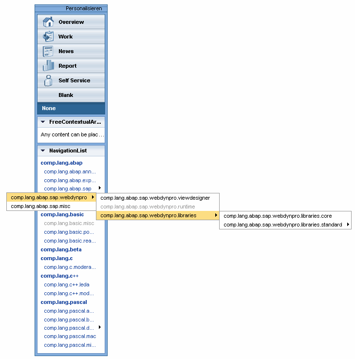
This UI element provides navigation functions with view switch. The navigation list can include more than three levels.
●
1. Phase 2
Element is represented as a group
in the navigation list
●
2. Phase 2
Element is represented as an
entry in a group in the navigation list
●
From phase
3
Element is represented as a menu
entry
The view switch is not automatically toggled. There is an INDEX parameter containing the index of the selected view switch (counting from 1 upwards).
The navigation list requests a context node that contains a recursion node on itself. This enables you to map a tree with any number of nodes with links. You can only click on the end node of this “tree”, that is if an element does not contain and subnodes with further elements.
This UI element is not released for use by customers. There is no support for its use. Instead, use the Tray or Group UI element.
When you click on a link in the navigation list, the ON_SELECT event is triggered. You can find the link you clicked on in the event parameter CONTEXT_ELEMENT (TYPE REF TO IF_WD_CONTEXT_ELEMENT).
Example of the Visual Display
Runtime Class |
CL_WD_CONTEXTUAL_PANEL |
Properties in View Designer
Name |
Type |
Initial Value |
Bindable |
STRING |
(automatic) |
No |
|
WDUI_CONTEXT_MENU_BEHAVIOUR |
inherit |
No |
|
WDY_MD_UI_ELEMENT_REFERENCE |
|
No |
|
WDY_BOOLEAN |
true |
Yes |
|
Translatable text |
|
Yes |
|
WDUI_VISIBILITY |
visible |
Yes |
|
I |
220 |
Yes |
Aggregations in the View Designer
Name |
Cardinality |
Type |
0..n |
ContextualPanelItem |
Events in the View Designer
Name |
Other properties that can be inherited are defined in the associated higher-level classes. The associated UI elements are:
Dynamic Programming
For dynamic programming, the same properties, events, and aggregations as in the View Designer are available. Bear in mind the different spellings.
Dynamic Programming of Properties
View Designer Name |
Runtime Name |
Type |
CONTEXT_MENU_BEHAVIOUR |
WDUI_CONTEXT_MENU_BEHAVIOUR |
|
contextMenuBehaviour: inherit |
CL_WD_CONTEXTUAL_PANEL=>E_CONTEXT_MENU_BEHAVIOUR-INHERIT |
|
contextMenuBehaviour: provide |
CL_WD_CONTEXTUAL_PANEL=>E_CONTEXT_MENU_BEHAVIOUR-PROVIDE |
|
contextMenuBehaviour: suppress |
CL_WD_CONTEXTUAL_PANEL=>E_CONTEXT_MENU_BEHAVIOUR-SUPPRESS |
|
CONTEXT_MENU_ID |
WDY_MD_UI_ELEMENT_REFERENCE |
|
ENABLED |
WDY_BOOLEAN |
|
TOOLTIP |
WDY_MD_TRANSLATABLE_TEXT |
|
VISIBLE |
WDUI_VISIBILITY |
|
visible: none |
CL_WD_CONTEXTUAL_PANEL=>E_VISIBLE-NONE |
|
visible: visible |
CL_WD_CONTEXTUAL_PANEL=>E_VISIBLE-VISIBLE |
|
WIDTH |
I |
|
Dynamic Programming of Events
View Designer Name |
Runtime Name |
ON_PERSONALIZE |
Dynamic Programming of Aggregations
View Designer Name |
Runtime Name |
Cardinality |
ITEMS |
0..n |
Example
You can find an example of this UI element in the system in component WDR_TEST_EVENTS in the view ContextualPanel.