
 TableColumn Properties

Properties in the View Designer
● cellDesign
Defines the background color of the table cell. See WDUI_TABLE_CELL_DESIGN.
● colSelectionState
Multiple selection of TableColumn (Test: WDR_TEST_TABLE → CELL_POPIN, and selected the required header). By pressing the CTRL key you can select additional table columns.
Value |
Visual Display |
Description |
notSelectable |
|
The table column cannot be selected |
notSelected |
|
The table column can be selected |
selected |
|
The table column is selected. |


● filterValue
Value for the filter cell of the column.
More information: Filtering in a Table
● filterValueSuggestions
This property is active only for WDUIGUIDELINE=GL20. It then has to be bound to an attribute of a context node with cardinality 0..n or 1..n. The values appear in the table header menu as "suggested values" for filtering.
More information: Filtering in a Table
● groupingValue
If rows in this column have the same groupingValue and are bound, they are displayed only in one cell. That means the TableCellEditor is displayed only once in the first row, and only one common cell border is shown.
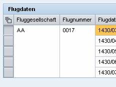 (Example)
If this feature is used, the TableCellEditor may not be input-enabled.
In accessibility mode, the groupingValue is ignored and the table is displayed without this feature.
● hAlign
Horizontal alignment of the cell content.
The alignment should be the same for each column, but can be overridden individually (by binding or the automatic mode in cell variants).

Ensure that the value for TableColumn.hAlign is the same as the value for the alignment specified in TableCellEditor.
This property can be personalized by an administrator.
Value |
Description |
Can be set using personalization |
auto |
The alignment is determined by the data type of the primary property of the TableCellEditor. The alignment is normally to the left, but if it is a TextView or a read-only InputField with a number, the alignment is to the right. |
Yes |
center |
Centered alignment |
Yes |
beginOfLine |
The text is always displayed at the beginning of the line. Therefore, the text content for value ltr of property textDirection is left-justified. The text content for value rtl is right-justified. |
Yes |
endOfLine |
The text is always displayed at the end of the line. Therefore, if property textDirection is set to ltr, the text content is right-justified. The text content for value rtl is left-justified. |
Yes |
forcedLeft |
The text content is always left-justified, regardless of whether property textDirection is set to ltr or rtl. |
Yes |
forcedRight |
The text content is always right-justified, regardless of whether the value of the textDirection property is ltr or rtl. |
Yes |
● isFiltered
Determines whether a filter icon is displayed in the column heading. This indicates that the current table entries are filtered according to values in this TableColumn.
● resizable
This property is presently not supported.
● selectedCellVariant
Determines the active table cell variants for a table cell. The variant whose variantKey matches the selectedCellVariant is used. If the value is set to initial, no cell variant is used, instead the properties of the table column itself and its TableCellEditor are used. An invalid selectedCellVariant is not allowed.
More information: Variants
● sortState
Describes how a table column is sorted. Sorting in a Table
The data in the table is not automatically displayed sorted by the sortState property and the onSort event; the application itself must sort the data.
Value |
Description |
up |
Sorted in ascending order |
down |
Sorted in descending order |
none |
Not sorted |
notSortable |
Cannot be sorted |
● width
Width of the table column. The effective width is as big as specified here and as the actual cell content. When Table.fixedTableLayout=true is set, the column is precisely as big as specified. If no width is specified, the content determines the width.
We recommend you use the same CSS unit of measure for all columns. More information: Methods and Properties of UI Elements.
This property can be personalized by an administrator.

This property, which does not have to be bound, can be changed by the client. More information: Properties Used in MultiPane or TablePopin.
Note the special case with an InputField in a Table.
More information: SAP Note 1253282