
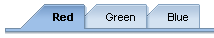
 HorizontalContextualPanel
Properties
HorizontalContextualPanel
Properties

Properties in View Designer
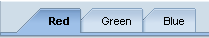
● design
Display of the UI element.
Value |
Visual Display |
Description |
emphasized |
|
Blue background |
standard |
|
Standard display |
● itemEnabled
Specifies whether or not an event can be triggered by a user interaction. If the value is TRUE, the view elements positioned above it are used at runtime to determine the value. This means that if the surrounding container is not enabled, all the containers within this are also not enabled.

In Web Dynpro ABAP “enabled” is always passed down from parent to child. If a UI element lies nested in another UI element that has enabled=FALSE, then this UI element has also enabled=false.
● itemSource
Context node with the data for the entries.
Structure of the itemSource for the HorizontalContextualPanel:
○ Always two-level:
For the itemSource property, use a context node containing a recursion node that refers to itself. A subnode (according to recursion) needs to be filled with elements for the second level for both the context node itself and all elements.
○ Mixed (one or two-level)
As with the "always one-level" setting, no second level is displayed for the tab of the first level if the subnode is not created for the second level. .
○ Always one-level:
Use a simple context node for the itemSource property
● itemText
Label text for the item.
● itemTextDirection
Text or writing direction.
This enables labels of interface elements to be read in languages that have an RTL writing direction, such as Arabic or Hebrew, as opposed to LTR for languages like English.
Value |
Description |
inherit |
The text direction is inherited from the parent element. Therefore, the text direction is identical to that of the parent element. |
ltr |
Left to right text direction |
rtl |
Right to left text direction |
● itemVisible
Visibility of the item.