
 TableRowGrouping

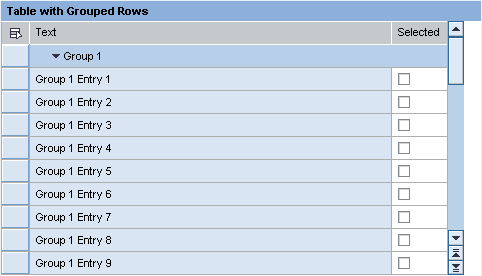
This UI element is used to display a table whose rows are in groups. A group is represented by an expandable/collapsible row that takes up the whole table width. The groups come from the elements of Table.dataSource. The data of a group must be in a context node below the group node. The binding is done using the groupData property.
Example of the Visual Display
|
|
Runtime Class |
CL_WD_TABLE_ROW_GROUPING |
Properties in the View Designer
Name |
Type |
Initial Value |
Bindable |
STRING |
(automatic) |
No |
|
WDY_BOOLEAN |
false |
Mandatory |
|
Context node |
|
Mandatory |
Aggregations in the View Designer
Name |
Cardinality |
Type |
0..1 |
||
0..1 |

Other properties that can be inherited are defined in the associated higher-level classes. The associated UI elements are:
Dynamic Programming
For dynamic programming, the same properties, events, and aggregations as in the View Designer are available. Bear in mind the different spellings.
Dynamic Programming of Properties
View Designer Name |
Runtime Name |
Type |
EXPANDED |
WDY_BOOLEAN |
|
GROUP_DATA |
OBJECT |
Dynamic Programming of Aggregations
View Designer Name |
Runtime Name |
Cardinality |
HEADER |
0..1 |
|
MENU |
0..1 |
Example
You can find an example of this UI element in the system in component WDR_TEST_TABLE under TableRowGrouping.