
 ToolBarButtonChoice

A ToolBarButtonChoice is a button that offers to choose among several options via a small triangle symbol, as is illustrated in the following figure.

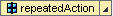
If the user clicks on the triangle symbol, a menu opens from which an action can be selected. When the user has selected an action, this action is set to the button and can then be executed by the user. The repeatSelectedAction property makes it possible that the last selected action remains on the button after execution of an action:
Description of UI Element Properties
● collapsible
Specifies whether the ToolBarButtonChoice can be collapsed.
● imageSource
defines the path to the icon source.
See: Specifying the Image Source
● repeatSelectedAction
Determines that the last selected action remains assigned to the button as long as there is no other one selected.
● selectedActionItem
Determines the selected action element.
● text
Determines the labeling of the ToolBarButtonChoice.
Properties Overview
Name |
Interface |
Type |
Initial Value |
Bindable |
collapsible |
IWDToolBarButtonChoice |
boolean |
false |
bindable |
enabled |
IWDUIElement |
boolean |
true |
bindable |
imageSource |
IWDAbstractButtonChoice |
String |
|
bindable |
repeatSelectedAction |
IWDAbstractButtonChoice |
boolean |
true |
bindable |
selectedActionItem |
IWDAbstractButtonChoice |
String |
|
bindable |
text |
IWDAbstractButtonChoice |
String |
|
bindable |
tooltip |
IWDUIElement |
String |
|
bindable |
visible |
IWDUIElement |
WDVisibility |
visible |
bindable |