
 TreeByNestingTableColumn

Definition
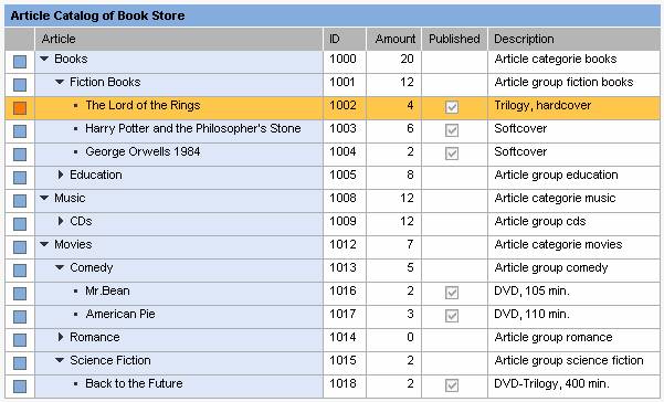
The TreeByNestingTableColumn element allows the integration of a tree structure into a table column.
Procedure
...
1. To insert a TreeByNestingTableColumn into a Table, select it in the Outline view of the Web Dynpro perspective, open the context menu and choose Insert → RowArrangement. Now you can select the TreeByNestingTableColumn.
Description of UI Element Properties
● cellDesign
Specifies the background color of the cell. The cellDesign property can take the following values and is represented by the enumeration type WDTableCellDesign.
badvalue_dark |
Dark background color that indicates a negative value. |
badvalue_light |
Light background color that indicates a negative value. |
badvalue_medium |
Medium background color that indicates a negative value. |
criticalvalue_dark |
Dark background color that indicates a critical value. |
criticalvalue_light |
Light background color that indicates a critical value. |
criticalvalue_medium |
Medium background color that indicates a critical value. |
goodvalue_dark |
Dark background color that indicates a good value. |
goodvalue_light |
Light background color that indicates a good value. |
goodvalue_medium |
Medium background color that indicates a good value. |
group_level1 |
Background color for cells of group level 1 |
group_level2 |
Background color for cells of group level 2 |
group_level3 |
Background color for cells of group level 3 |
key_medium |
Medium background color for cells of key column |
negative |
Background color that indicates a negative value. |
positive |
Background color that indicates a positive value. |
standard |
Standard background color, the same for the entire row |
● childrenLoaded
This specifies whether the lower-level nodes are loaded.
● colSelectionState
A column can be visualized as "not_selectable", "selected" or "not_selected". The TableColumn.colSelectionState property indicates the state. This property can be set by the application developer – for example, when the user triggers the TableColumn.onAction.
● design
This specifies the design of the cell background. The default value of this property is transparent. You can use the background colors fill1, fill2, and fill3 as separators between the individual semantically different cell contents. The cellBackgroundDesignproperty can have the following values and is represented by the enumeration type WDCellBackgroundDesign.
Value |
Short Description |
border |
This is the color of the cell borders. This value is used for nested grid layouts to create grid net lines. |
fill1 |
This color corresponds to the value primarycolor of the design property. |
fill2 |
This color corresponds to the value secondarycolor of the design property. |
fill3 |
This color corresponds to the color value of the third level of a Tree UI element. |
header |
This color is identical to the color of the header area of a Tree UI element or a table. |
plain |
White background. |
transparent |
The background is transparent. The individual cells are displayed without grid net lines. |
● expanded
This specifies whether a tree node is expanded.
● filterValue
You can use this property to define the value to be filtered and to bind it to a corresponding context attribute.
● headerTextWrapping
This determines whether the header text is wrapped.
● isFiltered
This specifies whether the values of the TreeByNestingTableColumn are filtered.
● isLeaf
This identifies a node element as an end node. The value trueindicates that no other subelements exist.
● resizable
This specifies whether the width of the table column can be modified by the user.
● sortState
This specifies the sort status of the TreeByNestingTableColumn. sortState is represented by enumeration type TableColumnSortDirection and can take the following values:
down |
The table column is sorted in descending order. |
none |
The table column is not sorted, but can be sorted. |
notSortable |
The table column cannot be sorted. |
up |
The table column is sorted in ascending order. |
● symbolDesign
This defines which kind of design is chosen to visualize the icons for nodes and leaves in the hierarchy. The symbolDesignproperty can have the following values and is represented by enumeration type WDTableHierarchySymbolDesign
○ simple. Only nodes will be visualized by leading icons
○ standard. Nodes and leaves will be visualized by leading icons
● visible
This
specifies whether or not the column is displayed.
The visible
property can have the following values and is represented by data type
WDVisibility.
blank |
The table column is not visible on the screen. This value has the same visibility effect for the table column on the screen as the value none. |
none |
The table column is not visible on the screen. |
visible |
The table column is displayed on the screen. |
● width
This specifies the width of the table column and can be specified in relative CSS units such as em, ex, or percentage.
Overview of Inherited and Additional Properties
Name |
Interface |
Type |
Initial Value |
Bindable |
cellDesign |
IWDAbstractMasterTableColumn |
WDTableCellDesign |
standard |
bindable |
childrenLoaded |
IWDAbstractTreeTableColumn |
boolean |
false |
bindable |
colSelectionState |
IWDAbstractMasterTableColumn |
WDTableColumnSelectionState |
notSelectable |
bindable |
design |
IWDAbstractMasterTableColumn |
WDCellBackgroundDesign |
transparent |
bindable |
expanded |
IWDAbstractTreeTableColumn |
boolean |
false |
bindable_mandatory |
filterValue |
IWDAbstractMasterTableColumn |
String |
|
bindable |
headerTextWrapping |
IWDAbstractMasterTableColumn |
boolean |
false |
bindable |
isFiltered |
IWDAbstractMasterTableColumn |
boolean |
false |
bindable |
isLeaf |
IWDAbstractTreeTableColumn |
boolean |
false |
bindable |
resizable |
IWDAbstractMasterTableColumn |
boolean |
true |
bindable |
sortState |
IWDAbstractMasterTableColumn |
WDTableColumnSortDirection |
notSortable |
bindable |
symbolDesign |
IWDAbstractTreeTableColumn |
WDTableHierarchySymbolDesign |
standard |
not_bindable |
visible |
IWDAbstractMasterTableColumn |
WDVisibility |
visible |
bindable |
width |
IWDAbstractMasterTableColumn |
String |
|
bindable |
Events
●
onLoadChildren
(String path)
This event is triggered when a tree node is expanded for the first
time.