
 CalendarPaginator


Definition
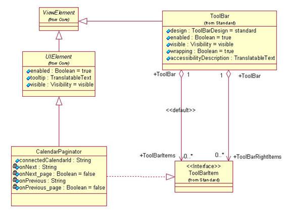
CalendarPaginator is a UI element that you can insert in a ToolBar. It allows the user to browse the calendar. The CalendarPaginator provides the browse buttons, texts and tool tips. Browsing must be implemented by the application developer.
Depending on the type of calendar displayed, the buttons should be used to navigate with the following methods:
● CalendarYearView
○ Left and right arrow: navigate to previous/next month
○ Double left and double right arrow: navigate to previous/next year
● CalendarMonthView and HierarchicalCalendarMonthView
○ Left and right arrow: navigate to previous/next week
○ Double left and double right arrow: navigate to previous/next month
● CalendarWeekView
Left and right arrow: tool tip and functionality is: go to previous week / go to next week
● CalendarDayView:
Left / right arrow: tool tip and functionality is: go to previous day / go to next day
Description of UI Element Properties
● collapsible
Specifies whether the CalendarPaginator can be collapsed.
● connectedCalendarId
Specifies the ID of the Calendar that the CalendarPaginator belongs to.
Properties Overview
Name |
Interface |
Type |
Initial Value |
Bindable |
collapsible |
IWDCalendarPaginator |
boolean |
false |
bindable |
connectedCalendarId |
IWDCalendarPaginator |
String |
|
bindable |
enabled |
IWDUIElement |
boolean |
true |
bindable |
tooltip |
IWDUIElement |
String |
|
bindable |
visible |
IWDUIElement |
WDVisibility |
visible |
bindable |
Events
● onNext (boolean page)
The event is triggered when the user clicks on a next arrow. The parameter page determines whether the double arrow was clicked
● onPrevious (boolean page)
The event is triggered when the user clicks on a previous arrow. The parameter page determines whether the double arrow was clicked.