
 ProgressIndicator

Definition
The ProgressIndicator UI element shows how much progress an activity has made in the form of a horizontal bar, along with the value that you have assigned to the percentValue property. You can use the displayValue property to display a text in the progress bar on the left side of the UI element. This makes it possible to provide descriptions with specific percentage values. You can hide the DisplayValue value using the showValue property. You can display the ProgessIndicator UI element in different colors using the barColor property. You can assign a popup menu to a ProgressIndicator.
Use
The ProgressIndicator can, for example, be used to display the completion status of a project as a percentage.
Description of UI Element Properties
● barColor
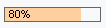
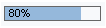
Specifies the logical color of the UI element. The default value of this property is neutral. The barColor property can be filled with the following values and is represented by the enumeration type WDProgressIndicatorBarColor.
Value |
Appearance of UI element ((width = 100 Pixel; displayValue = no value) |
Short Description |
critical |
|
Bar shown in orange. |
negative |
|
Bar shown in red. |
neutral |
|
Bar shown in blue. |
positive |
|
Bar shown in green. |


● displayValue
Used to display a text in the progress bar. You can set a value in the application to display a text such as “done” or “critical” for a specified percentage value. If you do not assign a value to this property, it takes by default the value you have assigned to percentValue, displayed as a text with a percentage sign – for example, 42%.
● percentValue
Specifies the progress made as a percentage.
● showValue
Specifies whether the value of the property displayValue – a text on the progress bar – is displayed or hidden.
● width
Specifies the width of the ProgressIndicator. You can specify the width in CSS units like em, ex, pixel, or percentage.
Properties Overview
Name |
Interface |
Type |
Initial Value |
Bindable |
barColor |
IWDProgressIndicator |
WDProgressIndicatorBarColor |
neutral |
bindable |
displayValue |
IWDProgressIndicator |
String |
|
bindable |
enabled |
IWDUIElement |
boolean |
true |
bindable |
percentValue |
IWDProgressIndicator |
int |
0 |
bindable |
showValue |
IWDProgressIndicator |
boolean |
true |
bindable |
tooltip |
IWDUIElement |
String (TranslatableText) |
|
bindable |
visible |
IWDUIElement |
WDVisibility |
visible |
bindable |
width |
IWDProgressIndicator |
String |
|
bindable |

The inherited enabled property is ignored and does not affect the browser.