Tool Bar

Definition
A toolbar provides quick and convenient access to a set of frequently used commands or options. A toolbar can contain buttons, input fields and dropdown list boxes. The toolbar offers a separator. The separator is a vertical line with padding on both sides and is used to space command groups.
The width of the toolbar is defined by the added controls (button, input field and so on). When the toolbar control is not used in a gridlayout or formlayout, it is always rendered in a new line.
· addToolbarButton
Adds a button to the toolbar. The toolbar button is similar to the "button" control but has less attributes. See ToolbarButton description for more details.
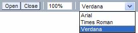
· addToolbarDropDownListBox
Adds a dropdown list box to the toolbar. See ToolbarDropDownListBox description for more details.
· addToolbarInputField
Adds a input field to the toolbar. See ToolbarInputField description for more details.
· addToolbarSeperator
Adds a vertical line with padding on both sides. The toolbar separator is used to space command groups. See ToolbarSeparator description for more details.
· design
Sets the design of the toolbar. Possible values are:
¡ EMPHASIZED
Displays a toolbar with darker background.
¡ STANDARD
Displays a toolbar with lighter background.
· id
Identification name of the toolbar.
Attributes |
M |
Values |
Usage |
addToolbarButton |
|
String (cs) |
Taglib Classlib |
addToolbarDropDownListBox |
* |
String (cs) |
Taglib Classlib |
addToolbarInputField |
|
String (cs) |
Taglib Classlib |
addToolbarSeparator |
|
- |
Taglib Classlib |
design |
|
EMPHASIZED |
Taglib Classlib |
id |
* |
String (cs) |
Taglib Classlib |
Example
using the taglib
<hbj:toolbar |
using the classlib
Form form = (Form)this.getForm(); |
Result