
 Group
Group 

The Web Dynpro class Group which implements the IWDGroup interface is the base class of a group UI element.
Definition
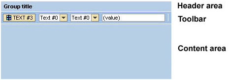
The Group UI element is a UI element container and can be used to group multiple UI elements under one common title. The following diagram shows that the UI element resembles a display panel with a colored background.

The enabled property has no effect on the UI element children you inserted into the UI element container. If, for example, you set the enabled property to false in the group UI element, an input field inserted in it is not automatically deactivated. If the UI element children in this group UI element are also to be deactivated, you must set the relevant property for each UI element separately.
The Group UI element with the default design primarycolor:
Description of UI Element Properties
● accessibilityDescription
When accessibility is activated, the assigned text is added to the tooltip. This description provides semantic details of the UI element and is only read by the screen reader if the user focuses the complete Ul element.
● defaultButtonId
Specifies the ID of the assigned default button.
● design
Describes the appearance of the Group UI element. The design property can be filled with the following values and is represented by the enumeration type WDGroupDesign.
primarycolor |
The group panel has the same background color as the title bar (color of the primary group). |
sapcolor |
The title bar and the borders around the panel have the blue SAP color. The background color of the panel is white. |
secondarybox |
The panel does not have borders. |
secondaryboxcolor |
The background color of the panel is different from the background color of the title bar. |
secondarycolor |
The panel has the same background color as the title bar (color of the secondary group). You can use this value when you want to display subgroups within a group. |
● enabled
The inherited enabledproperty is ignored and does not affect the browser. The label in the header of the Group UI element can be hidden by setting the value of the visibleproperty for the header to none.
● hasContentPadding
Specifies whether or not it is possible to insert padding between content and UI element borders.
● height
Determines the height of the Group, which you can specify in relative CSS units like em or ex.
● scrollingMode
Specifies how
the scroll bar appears within the UI element container.
The scrollingMode property can be filled with the following
values and is represented by the enumeration type WDScrollingMode.
auto |
The scroll bar within the container is activated automatically. |
both |
A vertical and horizontal scroll bar are activated. |
none |
Scrolling within the text context is not possible. |
● width
Determines the width of the Group. You can specify this in CSS sizes, such as em, ex, pixels or percentage values.
Properties Overview
Name |
Interface |
Type |
Initial Value |
Bindable |
IWDScrollContainer |
String |
|
bindable |
|
IWDScrollContainer |
String |
|
bindable |
|
IWDGroup |
WDGroupDesign |
primarycolor |
bindable |
|
enabled |
IWDUIElement |
boolean |
true |
bindable |
hasContentPadding |
IWDGroup |
boolean |
true |
bindable |
height |
IWDUIElementContainer |
String (CSS size) |
|
bindable |
scrollingMode |
IWDScrollContainer |
WDScrollingMode |
none |
bindable |
tooltip |
IWDUIElement |
String (TranslatableText) |
|
bindable |
visible |
IWDUIElement |
WDVisibility |
visible |
bindable |
width |
IWDUIElementContainer |
String (CSS size) |
|
bindable |