Tray
Tray

Definition
Similar to group the tray allows grouping of controls. The 'tray' allows additional functionality like collapsing/expanding - similar to the behavior of windows on your Microsoft Windows desktop. The tray control can be for client side eventing. See the EventValidationComponent description for more details.
Portal components (components that will run in the SAP Enterprise Portal) are placed in a tray by the portal.
· design
The design of the tray can be:
¡ BORDER
The tray has a title bar and the panel has a frame that defines the size.
¡ BORDERLESS
The tray has only a title bar.
¡ FORM
The tray has a title bar. The panel is filled with a background color. The color is different from the title background color.
¡ TEXT
The tray has a title bar. The panel is filled with the same background color as the title bar.
· enabled - inherited from EventValidationComponent.
A boolean value that enables (=true) or disables (=false) the tray control. A disabled tray sends no event when clicked.
· id
Identification name of the tray.
· isCollapsed
A boolean value that if "true" shows only the title
bar. As indicator that the tray is collapsed, the collapsed symbol is
displayed.  When clicking on this symbol the 'onExpand'
event is fired.
When clicking on this symbol the 'onExpand'
event is fired.
· jsObjectNeeded - inherited from Component.
A boolean value that defines if a JavaScript object has to be generated for the tray component.
· menu
Set a hover menu for the tray.
· onCollapse
Defines the event handling method that will be
processed when the user clicks on the collapse symbol  .
.
If the attribute is set to a <%=null %> string or the attribute is omitted the symbol is not displayed in the title bar.
· onEdit - Deprecated
Defines the event handling method that will be
processed when the user clicks on the collapse symbol  .
.
If the attribute is set to a <%=null %> string or the attribute is omitted the symbol is not displayed in the title bar.
· onExpand
Defines the event handling method that will be
processed when the user clicks on the expand symbol  .
.
This symbol can be actives only when 'isCollapsed' is set to "true". If the attribute is set to a <%=null %> string or the attribute is omitted the symbol is not displayed in the title bar.
· onRemove - Deprecated
Defines the event handling method that will be
processed when the user clicks on the expand symbol  .
.
If the attribute is set to a <%=null %> string or the attribute is omitted the symbol is not displayed in the title bar.
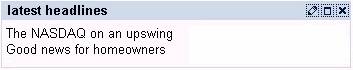
· title
Defines the string of text placed left aligned in the title bar. If no title should be displayed an empty string (null) can be used. The width of the tray is automatically adjusted to the length of the text when the 'width' attribute is set smaller than the title text width.
· tooltip
Defines the hint of the tray which is displayed as the mouse cursor passes over the tray, or as the mouse button is pressed but not released.
· width
Defines the width of the tray. The width of the button is automatically adjusted to the length of the 'title'. To see an effect of the 'width' attribute 'width' has to be set higher as the width defined thru the length of the 'title' string. If an empty (null) 'title' string is set no 'title' attribute is defined the width of the tray is set according to the 'width' attribute.
Attributes |
M |
Values |
Usage |
design |
|
BORDER
(d) |
Taglib Classlib |
enabled* |
|
FALSE |
Taglib
Classlib |
id |
* |
String (cs) |
Taglib Classlib |
isCollapsed |
|
FALSE (d) |
Taglib Classlib |
jsObjectNeeded** |
|
FALSE (d) |
Taglib
Classlib |
menu |
|
Component |
Taglib
Classlib |
title |
|
String |
Taglib Classlib |
tooltip |
|
String |
Taglib Classlib |
width |
|
Unit (50%) |
Taglib Classlib |
Events |
M |
Values |
Usage |
onCollapse |
|
String (cs)
|
Taglib Classlib |
onEdit Deprecated |
|
String (cs)
|
Taglib Classlib |
onExpand |
|
String (cs)
|
Taglib Classlib |
onRemove Deprecated |
|
String (cs)
|
Taglib Classlib |
trayBody
Defines the items in the tray. A tray can be filled with any any control (checkbox, image, textView and so on).
Example
using the taglib
<hbj:tray |
using the classlib
Form form = (Form)this.getForm(); |
Result