
 ContextualPanel


To be used by the Pattern and Portal Platform group only. Use by other applications and customers WILL NOT BE SUPPORTED! Should only be used for Work Center / Control Center applications.
Definition
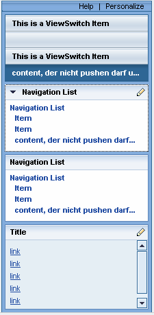
A ContextuaPanel is an area on the left side of the view. It can consist of the following UI elements:
● ViewSwitch
● FreeContextualArea
● NavigationList.
The screenshot below illustrates the design of a ContextualPanel:
Description of UI Element Properties
● width
Specifies the width of the ContextualPanel and is of type int. It is a defined width without scrolling. If any texts are too long for the defined width, the text will be cut off. The only indication you see is an ellipsis that shows that there is more text. If the user places the cursor on the text, the tool tip will show the entire text.
Properties Overview
Name |
Interface |
Type |
Initial Value |
Bindable |
enabled |
IWDUIElement |
boolean |
true |
Bindable |
tooltip |
IWDUIElement |
String |
|
Bindable |
visible |
IWDUIElement |
WDVisibility |
visible |
Bindable |
width |
IWDContextualPanel |
int |
220 |
Bindable |
Events
● onPersonalize
Event onPersonalize is triggered if the user clicks the personalize button.