Groups of Entry Fields

|
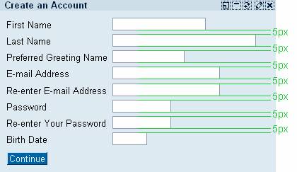
Offset between fields |
|
|
|
|
|
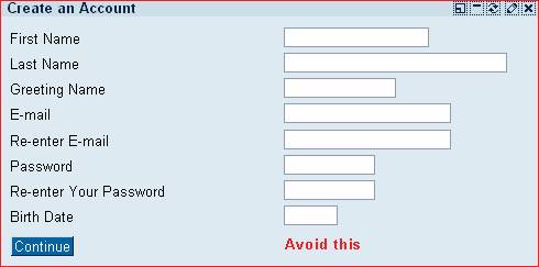
Fields have ragged edges |
|
|
|
|
|
Example of justified fields |
|
|
|
|
|
Offset between label and fields |
|
|
|
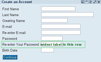
As one
can never predict the length of a field label on the one side, and how many
fields will be necessary in one scenario in succession on the other, it is
hardly possible to give a standard offset between label and entry field. |
|
Offset between label and fields |
|
|
|
|


|
Example of too large offset between label and fields |
|
|
|
|
|
Example of too small offset between label and fields |
|
|
|
|