
 Table API

Definition
A Table represents a two-dimensional data set arranged in rows and columns. A Table UI element is built of TableColumns. You define the content of a Table with the dataSource property, the TableColumns have TableCellEditors you have to bind to the attributes of the context node dataSource is bound to.
Description of UI Element Properties
● accessibilityDescription
When accessibility is activated, the assigned text is added to the tooltip. This description provides semantic details of the UI element and is only read by the screen reader if the user focuses the complete Ul element.
● compatibilityMode
This property allows application developers to adapt applications to changed behavior in a new Release. compatibilityMode is represented by enumeration type WDTableCompatibilityMode and can take the following values:
auto |
Specifies the behavior of the table according to the Release in which the application was created. |
nw04Plus |
The behavior of the table is the standard behavior for Releases after NW04. |
● dataSource
You use this property to specify the data source. To do this, you need to specify the path to the context node that provides the data.
● design
Determines the appearance of the table. The property design can take the following values and is represented by enumeration type WDTableDesign.
transparent |
Transparent cell background The value of gridMode will be ignored |
transparentWithGrid |
Transparent cell background for table. The value of gridMode will be considered. |
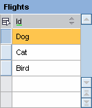
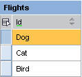
● displayEmptyRows
specifies whether empty rows are displayed depending on the value specified for visibleRowCount.
The screenshot below illustrates the behavior of displayEmptyRows
Number of elements = 3 visibleRowCount = 5 displayEmptyRows = true (default)
|
Number of elements = 3 visibleRowCount = 5 displayEmptyRows = false
|
|
|
● emptyTableText
Specifies the text to be displayed if the rows in the table are empty. If you do not enter a text here, a standard text will be displayed if property visibleRowCount is -1.
● firstVisibleRow
Specifies which row of the table is displayed as the first row.
● firstVisibleScrollableCol
Specifies the ID of the first horizontally scrollable column after all fixed columns.
● fixedTableLayout
Specifies whether the table obeys the layout restrictions. If this is set to true, the content of the row will be cut off if it is longer than the allowed width.
● footerVisible
Specifies whether footer is displayed.
● gridMode
Specifies if and how a border is displayed. gridMode is of enumeration type WDTableGridMode and can take the following values:
both |
|
none |
No borders are displayed |
vertical |
Only vertical borders are displayed |
horizontal |
Only horizontal borders are displayed |
The default setting is both.
● legendId
Specifies the ID of the assigned legend.
● multiColSorting
specifies whether the option to define more than one table column as sort criteria is enabled.
● readOnly
Specifies whether or not the table can be edited. If this is set to true, the data in the table cannot be edited.
● rowSelectable
Specifies whether or not a row can be selected.
● scrollableColCount
Specifies the number of visible scrollable columns. If this is set to -1, all columns will be displayed.
● selectedPopin
Specifies the selected TablePopin.
● selectionChangeBehaviour
Changes to the lead selection can cause data loss – for example, if the changed or new data was not written to the context due to syntax errors. You can avoid this using the selectionChangeBehaviourproperty before lead selection is changed: This property is represented by enumeration type WDTableSelectionChangeBehaviour and can take the following values:
auto |
Specifies that the UI element automatically changes the lead selection after an interaction by the user before the corresponding event is triggered. |
manual |
Specifies that the UI element does not change the lead selection after an interaction by the user but triggers the corresponding event. In this case, the event handler must change the lead selection to enable the UI element to display the data. This setting allows you to check changes made to the lead selection. |
ifNoLoss |
Specifies that the lead selection only changes if all user entries are written to the context. The lead selection is then changed automatically, and the corresponding event is triggered. Otherwise, the event is triggered, but the lead selection is not changed. |
● selectionMode
Specifies
how the table rows can be selected.
Normally, the way table rows are selected Is specified by the definition of
the context node. However, you can change the selection using the selectionModeproperty. The
selectionMode property is
represented by the enumeration type WDTableSelectionMode and can take the
following values:
auto |
The selection mode is determined automatically by data binding. |
multi |
Multiple table rows can be selected if the context node allows multiple selection. |
none |
No selection possible |
single |
Only one row can be selected at a time. |
multiNoLead |
Multiple rows can be selected, a lead selection is not displayed. |

If you assign the single value to the selectionModeproperty, you can only select one row at a time, even if multiple is defined for the context node.
● visibleRowCount
Specifies the number of table rows that can be displayed without the user needing to scroll.
The value -1 is deprecated. Use displayEmptyRows = false and specify a maximum value of visible rows in visibleRowCount.
● width
Specifies the width of the table and can be specified in relative CSS units like em, ex, or percentage.
Properties Overview
Name |
Interface |
Type |
Initial Value |
Bindable |
accessibilityDescription |
IWDTable |
String |
|
bindable |
compatibilityMode |
IWDTable |
WDTableCompatibilityMode |
auto |
bindable |
dataSource |
IWDTable |
Object |
|
bindable_mandatory |
design |
IWDTable |
WDTableDesign |
standard |
bindable |
displayEmptyRows |
IWDTable |
boolean |
true |
bindable |
emptyTableText |
IWDTable |
String |
|
bindable |
firstVisibleRow |
IWDTable |
int |
0 |
bindable |
firstVisibleScrollableCol |
IWDTable |
String |
|
bindable |
fixedTableLayout |
IWDTable |
boolean |
false |
bindable |
footerVisible |
IWDTable |
boolean |
true |
bindable |
gridMode |
IWDTable |
WDTableGridMode |
both |
bindable |
legendId |
IWDTable |
String |
|
bindable |
multiColSorting |
IWDTable |
boolean |
false |
bindable |
readOnly |
IWDTable |
boolean |
false |
bindable |
rowSelectable |
IWDTable |
boolean |
true |
bindable |
scrollableColCount |
IWDTable |
int |
-1 |
bindable |
selectedPopin |
IWDTable |
String |
|
bindable |
selectionChangeBehaviour |
IWDTable |
WDTableSelectionChangeBehaviour |
auto |
not_bindable |
selectionMode |
IWDTable |
WDTableSelectionMode |
auto |
bindable |
visibleRowCount |
IWDTable |
int |
5 |
bindable |
width |
IWDTable |
String |
|
bindable |
See also: Common UI Element Properties
Events
● onColSelect
This event is triggered if the user clicks a table column header.
● onFilter
Event
on Filter is triggered
if filter symbol  is selected n the first table
column.
is selected n the first table
column.
● onLeadSelect
Event
onLeadSelect is triggered
if lead selection for the table changes.
The event parameters are the ID of the column and the row number (starting at
0).
● onSort
Event
onSort is triggered
if the clicks the sort icon in a column header.
Event parameters are the required sort direction and the ID of the column to
be sorted. The sort status of a column is automatically displayed in the
column in question:
Unsorted |
|
Ascending |
|
Descending |
|


