ToolBarButton Properties
Properties in View Designer
- collapsible
Collapses an element.
Note that the collapsible property is only available for standard ToolBar elements, and not for right-aligned ToolBar elements.
This property can be personalized by administrators.
- design
Design of the UI element, for example, button label is highlighted.
This property can be personalized by administrators.
Values Visual Display Description Can Be Set Using Personalization standard
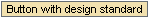
Displays the UI element with a standard background or text color
Yes
previous

Scrolls backwards
Yes
next
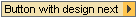
Scrolls forwards
Yes