Group Properties
- activateAccessKey
Activates access keys.
Both users and administrators can personalize this property.
- design
Display of the UI element.
This property can be personalized by administrators.
Value Visualization Description Can Be Set Using Personalization primarycolor
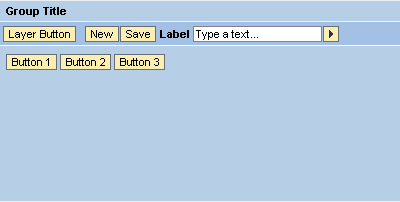
The group panel has the same background color as the title bar (color of the primary group).
Yes
sapcolor

The title bar and the borders around the panel have the blue SAP color. The background color of the panel is white.
Yes
secondarybox
The panel does not have borders.
Yes
secondaryboxcolor

The background color of the panel is different from the background color of the title bar.
Yes
secondarycolor
The panel has the same background color as the title bar (color of the secondary group). You can use this value when you want to display subgroups within a group.
Yes
underline

A line is displayed under the title to separate it; the colors of the title bar and the panel are the same.
Yes
- hasContentPadding
Specifies whether or not it is possible to insert padding between content and UI element borders.
This property can be personalized by administrators.