ThresholdSlider
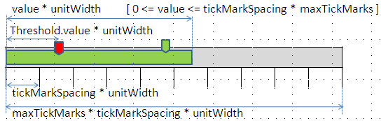
A ThresholdSlider is for the bar-like depiction of a state or an integer value. The color changes in accordance with defined threshold values. The interval between two of these Threshold values is a unit and the size of this interval is determined in pixels by the property unitWidth. A ThresholdSlider aggregates Threshold s. The Thresholds determine the color changes of the ThresholdSlider for example.
The total tooltip of the ThresholdSlider is ThresholdSlider.tooltip plus tooltip of the active Threshold.
The small markings under a ThresholdSlider are TickMarks, which help the underside of the ThresholdSlider to look like a ruler.You can use the showTickmarks property to determine whether these TickMarks should be shown or not. The distance in units between two TickMarks is determined by the TickMarkSpacing property.
The width of a ThresholdSlider is determined by the number of TickMark intervals, which is set by the maxTickMarks property.The width of a ThresholdSlider in Pixels can therefore be calculated as follows:
maxTickMarks * TickMarkSpacing * unitWidth
Example of the Visual Display

| Runtime Class |
CL_WD_THRESHOLD_SLIDER |
Properties in the View Designer
| Name | Type | Initial Value | Bindable |
|---|---|---|---|
|
STRING |
(automatic) |
No |
|
|
WDUI_CONTEXT_MENU_BEHAVIOUR |
inherit |
No |
|
|
WDY_MD_UI_ELEMENT_REFERENCE |
No |
||
|
WDY_BOOLEAN |
true |
Yes |
|
|
I |
0 |
Yes |
|
|
WDY_BOOLEAN |
false |
Yes |
|
|
WDY_BOOLEAN |
true |
Yes |
|
|
I |
1 |
Yes |
|
|
Translatable text |
Yes |
||
|
I |
5 |
Yes |
|
|
I |
Mandatory |
||
|
WDUI_VISIBILITY |
visible |
Yes |
Aggregations in the View Designer
| Name | Cardinality | Type |
|---|---|---|
|
0..n |
Events in the View Designer
Other properties that can be inherited are defined in the associated higher-level classes. The associated UI elements are:
For dynamic programming, the same properties, events, and aggregations as in the View Designer are available. Bear in mind the different spellings.
Dynamic Programming of Properties
| View Designer Name | Runtime Name | Type |
|---|---|---|
|
CONTEXT_MENU_BEHAVIOUR |
WDUI_CONTEXT_MENU_BEHAVIOUR |
|
|
contextMenuBehaviour: inherit |
CL_WD_THRESHOLD_SLIDER=>E_CONTEXT_MENU_BEHAVIOUR-INHERIT |
|
|
contextMenuBehaviour: provide |
CL_WD_THRESHOLD_SLIDER=>E_CONTEXT_MENU_BEHAVIOUR-PROVIDE |
|
|
contextMenuBehaviour: suppress |
CL_WD_THRESHOLD_SLIDER=>E_CONTEXT_MENU_BEHAVIOUR-SUPPRESS |
|
|
CONTEXT_MENU_ID |
WDY_MD_UI_ELEMENT_REFERENCE |
|
|
ENABLED |
WDY_BOOLEAN |
|
|
MAX_TICK_MARKS |
I |
|
|
READ_ONLY |
WDY_BOOLEAN |
|
|
SHOW_TICK_MARKS |
WDY_BOOLEAN |
|
|
TICK_MARK_SPACING |
I |
|
|
TOOLTIP |
WDY_MD_TRANSLATABLE_TEXT |
|
|
UNIT_WIDTH |
I |
|
|
VALUE |
I |
|
|
VISIBLE |
WDUI_VISIBILITY |
|
|
visible: none |
CL_WD_THRESHOLD_SLIDER=>E_VISIBLE-NONE |
|
|
visible: visible |
CL_WD_THRESHOLD_SLIDER=>E_VISIBLE-VISIBLE |
Dynamic Programming of Events
Dynamic Programming of Aggregations
| View Designer Name | Runtime Name | Cardinality |
|---|---|---|
|
THRESHOLDS |
0..n |
You can find an example of this UI element in the system in the WDR_TEST_THRESHOLD_SLIDER component.