Label
The Label UI element is used to label other UI elements. It is always associated, therefore, with another UI element. You can use a Label for the following UI elements:
- BreadCrumb
- Caption
- CheckBox and CheckBoxGroup
- DropDownByKey and DropDownByIndex
- FileDownload and FileUpload
- FormattedTextEdit and FormattedTextView
- Image
- InputField
- ItemListBox
- LinkToAction and LinkToUrl
- ProgressIndicator
- RadioButton, RadioButtonGroupByIndex, and RadioButtonGroupByKey
- Table
- TextEdit and TextView
- ThresholdSlider
- TransparentContainer
- TriStateCheckBox
The appearance of a Label is defined by the design property.
If the assigned UI element has the status required, this is indicated by a small red star to the right of the label text.
With an inactive UI element (enabled=false) the label is also indicated as inactive.
If the assigned UI element has an explanation text and the help mode is activated, this is indicated by a small i to the right of the label text. When you move the mouse over the label, the text is displayed.
By clicking on the label, the assigned UI element is activated (dropdown* UI elements and input fields are focused, check boxes toggled and radio buttons selected).
Depending on the size of the browser window and the browser used, functions for Truncating Contents are available for Labels in a FormLayout:
This UI element supports the accessibility of the Web Dynpro application.
To enable the development of accessible applications, the tooltip property is not checked during the syntax check.
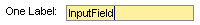
Example of the Display with an InputField
| Runtime Class |
CL_WD_LABEL |
Properties in the View Designer
| Name | Type | Initial Value | Bindable |
|---|---|---|---|
|
STRING |
(automatic) |
No |
|
|
WDUI_CONTEXT_MENU_BEHAVIOUR |
inherit |
No |
|
|
WDY_MD_UI_ELEMENT_REFERENCE |
No |
||
|
WDUI_LABEL_DESIGN |
standard |
Yes |
|
|
WDY_BOOLEAN |
true |
Yes |
|
|
WDY_MD_UI_ELEMENT_REFERENCE |
No |
||
|
Translatable text |
Yes |
||
|
WDUI_TEXT_DIRECTION |
inherit |
Yes |
|
|
Translatable text |
Yes |
||
|
WDUI_VISIBILITY |
visible |
Yes |
|
|
STRING |
Yes |
||
|
WDY_BOOLEAN |
false |
Yes |
Other properties that can be inherited are defined in the associated higher-level classes. The associated UI elements are:
For dynamic programming, the same properties, events, and aggregations as in the View Designer are available. Bear in mind the different spellings.
Dynamic Programming of Properties
| View Designer Name | Runtime Name | Type |
|---|---|---|
|
CONTEXT_MENU_BEHAVIOUR |
WDUI_CONTEXT_MENU_BEHAVIOUR |
|
|
contextMenuBehaviour: inherit |
CL_WD_LABEL=>E_CONTEXT_MENU_BEHAVIOUR-INHERIT |
|
|
contextMenuBehaviour: provide |
CL_WD_LABEL=>E_CONTEXT_MENU_BEHAVIOUR-PROVIDE |
|
|
contextMenuBehaviour: suppress |
CL_WD_LABEL=>E_CONTEXT_MENU_BEHAVIOUR-SUPPRESS |
|
|
CONTEXT_MENU_ID |
WDY_MD_UI_ELEMENT_REFERENCE |
|
|
DESIGN |
WDUI_LABEL_DESIGN |
|
|
design: emphasized |
CL_WD_LABEL=>E_DESIGN-EMPHASIZED |
|
|
design: light |
CL_WD_LABEL=>E_DESIGN-LIGHT |
|
|
design: standard |
CL_WD_LABEL=>E_DESIGN-STANDARD |
|
|
ENABLED |
WDY_BOOLEAN |
|
|
LABEL_FOR |
WDY_MD_UI_ELEMENT_REFERENCE |
|
|
TEXT |
WDY_MD_TRANSLATABLE_TEXT |
|
|
TEXT_DIRECTION |
WDUI_TEXT_DIRECTION |
|
|
textDirection inherit |
CL_WD_LABEL=>E_TEXT_DIRECTION-INHERIT |
|
|
textDirection ltr |
CL_WD_LABEL=>E_TEXT_DIRECTION-LTR |
|
|
textDirection rtl |
CL_WD_LABEL=>E_TEXT_DIRECTION-RTL |
|
|
TOOLTIP |
WDY_MD_TRANSLATABLE_TEXT |
|
|
VISIBLE |
WDUI_VISIBILITY |
|
|
visible: none |
CL_WD_LABEL=>E_VISIBLE-NONE |
|
|
visible: visible |
CL_WD_LABEL=>E_VISIBLE-VISIBLE |
|
|
WIDTH |
STRING |
|
|
WRAPPING |
WDY_BOOLEAN |
You can find examples of this interface element in the system in the WDR_TEST_UI_ELEMENTS Web Dynpro application and in the WDR_TEST_EVENTS component in the InputField view.