Layout Basics
The layout specifies the arrangement of the UI elements in their UIElementContainer. An object of the type Layout must be added to each container. You have to aggregate an appropriate object of type LayoutData for each child object in this container. LayoutData controls the layout properties of the respective child object in the container, for example, this could be the position in a coordination system defined by the layout.
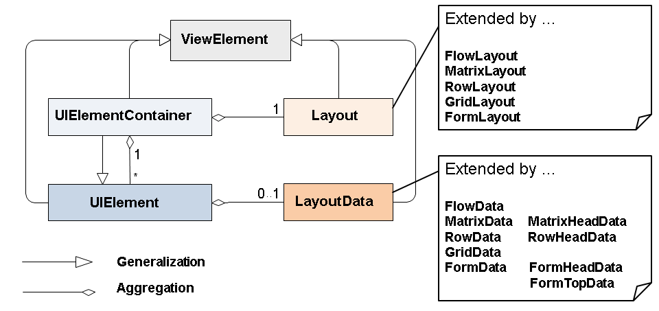
Each UI element container aggregates a corresponding layout object that describes how the inserted UI element children are assigned within the container. This type of layout object is a subclass of the abstract base UI element Layout.
The following layout UI elements are available for arranging the UI elements in a view:
-
A FlowLayout sequentially arranges the container children. This means that you cannot describe defined line breaks, for example. A FlowLayout depends on the client technology and the size of the browser window.
You can use the following UI elements in a FlowLayout without them being wrapped in the screen output.
-
InputField
-
Label
-
FormattedTextView
-
TextView
-
Button
-
ButtonChoice
-
LinkChoice
-
LinkToAction
-
LinkToUrl
-
CheckBox
-
DropDownByIndex
-
DropDownByKey
-
RadioButton
-
ToggleLink
-
ToggleButton
-
TriStateCheckBox
-
Image
-
-
A MatrixLayout arranges the container children in a tabular format. You can use the properties stretchedHorizontally and stretchedVertically to specify whether or not the UI elements match the container size. You cannot explicitly define the number of columns, for example, which you can do when using the GridLayout. Instead you assign a MatrixHeadData to a UI element so this UI element is wrapped. It is a great advantage of the MatrixLayout over the GridLayout that you can easily create consistent layout structures using the provided cell classes.
-
A RowLayout has a similar behavior to the MatrixLayout. However, it sequentially assigns the UI elements to exactly one column. If you assign a RowHeadData to a UI element, it is exactly this UI element that is wrapped. It is a great advantage of the RowLayout that you can easily create consistent layout structures using the predefined cell classes, which are also provided in the MatrixLayout.
You can use the same elements as above for a FlowLayout also in a RowLayout without them being wrapped in the screen output.
-
Note
Instead of the GridLayout, use the MatrixLayout whenever possible.
A GridLayout arranges the container children in a two-dimensional grid with a defined column number and any number of rows. Line breaks can be defined. Line breaks are automatically inserted when a UI element is too long to be displayed within one row.
-
A FormLayout is similar to a GridLayout, whereby the container children are arranged in a grid like columns in a newspaper. With FormTopData you can insert a new Panel, with FormHeadData you can insert a line break, and with FormData you can insert a new cell next to an existing cell.
Dynamic Programming
For dynamic programs you can use CL_WD_DYNAMIC_TOOL->CREATE_LAYOUT_DATA to create the correct layout data for a UI element.
This occurs (almost) automatically in the ABAP Workbench in the View Designer.