ItemListBox
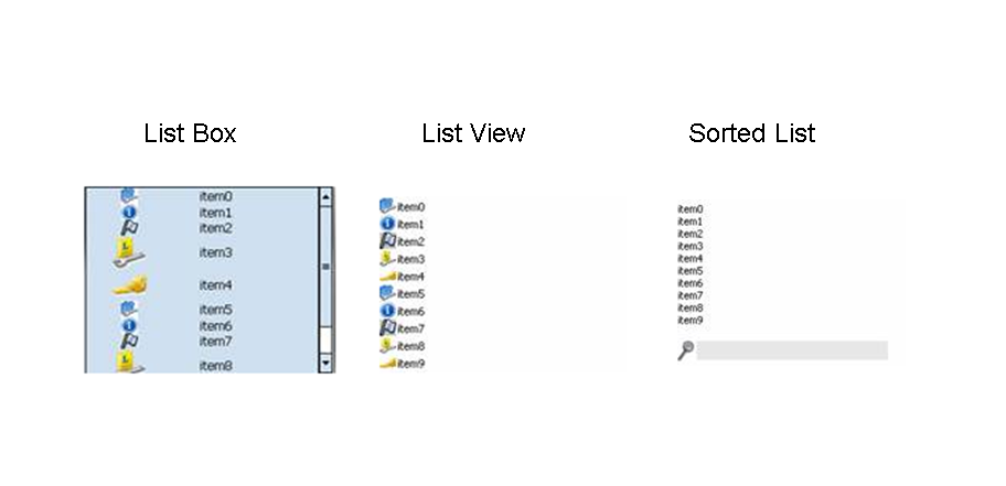
SAP NetWeaver Mobile supports an ItemListbox which provides a similar but reduced functionalty than that of standard Web Dynpro ItemListbox . The overall functionality of the ItemListbox is similar to the DropDownBox .You can vary the number of displayed values and, in contrast to a DropDownBox , multiple selection is possible. There are three type of the graphical representation using this control are possible in the UI: Sorted List (default), List View, List Box.
Description of UI Element Properties
-
dataSource
This property is used to specify the data source. You can use it to specify the path to the context node providing the data.
-
descriptiveText
This property defines a descriptive text that is displayed within the ItemListBox beside the text.
-
iconSource
Defines the path to the icon image source.
-
multipleSelection
This property enables the selection of several elements.
-
readOnly
This property controls whether the user can choose an element from the ItemListBox UI element.
-
selectionChangeBehaviour
The change of the lead selection can cause a data loss - for example, if the changed or new data was not written to the context due to syntax errors. You can avoid the data loss using the selectionChangeBehaviour property before changing the lead selection:
auto
If the data was written to the context, the value auto specifies that the ItemListBox automatically changes the lead selection of its data source directly after an interaction by the user before the corresponding event is triggered.
manual
Specifies that the ItemListBox does not change the lead selection of its data source after an interaction by the user but triggers the corresponding event. In this case, the event handler must change the lead selection to enable the ItemListBox to display the data in a main detail view, for example. This setting allows you to check the change of the lead selection.
-
text
This property specifies the text to be assigned to the ItemListBox .
-
visibleItems
This property defines the size of the item list box on the basis of the number of visible elements.
-
width This property specifies the width of the item list box and can be specified in CSS units like em, ex, pixels, or percentage.
-
Properties Overview
|
Name |
Type |
Initial Value |
Bindable |
|
dataSource |
Object |
bindable_mandatory |
|
|
descriptiveText |
String |
Bindable |
|
|
Enabled |
boolean |
true |
Bindable |
|
iconSource |
String |
Bindable |
|
|
multipleSelection |
boolean |
false |
Bindable |
|
readOnly |
boolean |
false |
Bindable |
|
selectionChangeBehaviour |
auto |
not_bindable |
|
|
T ext |
String |
Bindable |
|
|
V isible |
Visibility |
visible |
bindable |
|
visibleItems |
int |
10 |
Bindable |
|
W idth |
String |
Bindable |
Events
-
onLeadSelect (int index) This event is triggered when the user selects an element of the ItemListBox .
Customization
Aside from the design time properties it's possible to apply additional configuration for this control from the wdDoModifyView(View view, boolean firstTime)method of the View controller.
Please note the properties related to the graphical representation of the control can be defined on first method wdDoModifyView call only (firstTime paramenter is true) and cannot be changed during the runtime.
Graphical representation types
ItemListBox control has 3 types of swt-impementaion - ListView , ListBox , SortedList . Using wdDoModifyView() method of the view containing the ItemListBox you can set innerType to one of three predefined constants. An example of how this function call should look is below
view.get <ItemListBox> ViewItem().setInnerType(CommonConstants. constant );
Where constant would be one of the following types:-
|
List Type |
Constant |
|
List View |
TYPE_LISTVIEW |
|
List Box |
TYPE_LISTBOX |
|
Sorted List |
TYPE_SORTEDLIST |
Additional visual customisations
The List View and List Box also have additional visual customizations:
ListView
You can set additional list view density constants using the following method.
view.getItemListBoxViewItem().setListViewStyle(CommonConstants. constant )
Where contant is one of the following:
|
Constant |
Effect |
|
LISTVIEW_LOW |
a low list items density level |
|
LISTVIEW_MEDIUM |
a medium items density level |
|
LISTVIEW_HIGH |
a high items density level with large icons |
You can also change the orientation of the List view items using the follwing method.
view.get <ItemListBox> ViewItem().setListViewItemsOrientation(CommonConstants .constant )
Where constant is one of the following:
|
Constant |
List view items layout |
|
SWT_VERTICAL |
Vertical |
|
SWT_HORIZONTAL |
Horizontal |
ListBox
You can change various style and appearance attributes of a ListBox using the following method.
view.get <ItemListBox> BoxViewItem().setListBoxStyle(CommonConstants .constant )
You can can combine modifier styles along with layout styes using the or operator ("|").
view.get <ItemListBox> BoxViewItem().setListBoxStyle(CommonConstants .constant1 | CommonConstants .constant2 );
Possible constant values for modifier and style types are as follows:
|
Constant |
Purpose |
Type |
|
LISTBOX_STYLE_NO_HEADING_TEXT |
Single line item, 1 colum |
Layout |
|
LISTBOX_STYLE_1LINE_ITEM |
Single line item, 2 columns |
Layout |
|
LISTBOX_STYLE_2LINE_ITEM |
Double line item, 1 column with heading and detail combined |
Layout |
|
LISTBOX_MOD_SHOW_SELECTION_NUMBER |
Displays a single digit number aligned with each item which may be used to select the item |
Modifier |
|
LISTBOX_MOD_SHOW_HEADING_ICONS |
Displays an icon with associated heading text |
Modifier |
|
LISTBOX_MOD_SHOW_DETAIL_ICONS |
Displays icons with associated detail text |
Modifier |