
 Standardized User Interface

Use
Seasonal Procurement uses a uniform user interface for displaying and processing your data in the following Workbench applications:
· Purchase Order Manager
· OTB Procurement
· OTB Monitor
· Active Purchase Order Monitor
· Reactive Purchase Order Monitor
· Contract Monitor
Integration
All the workbenches are listed under the Goto menu item. On the SAP Easy Access screen, choose Logistics → Retailing → Purchasing → Seasonal Procurement and then either PO Processing, Open-to-Buy (OTB), or Procurement Monitoring to call the workbenches.
This documentation goes on to explain the common features of the user interfaces. It does not go into the differences in details between the applications.
All workbenches are based on the same concept for user interaction and use a similar screen control. In the case of change and display transactions, you are first taken to a selection screen and the results of your selection fill a worklist.
Standard screen sequence
...
1. Initial screen
When you call, for example, the Purchase Order Manager, an empty selection screen with the following structure appears:

2. Selection screen
If you choose  with the
quick info text Call Selection Tree, an application-specific selection screen
like the following appears:
with the
quick info text Call Selection Tree, an application-specific selection screen
like the following appears:

3. Worklist (overview)
The system displays the worklist as a directory tree on the left hand side of the screen in the form of a hierarchical tree. The following graphic shows the worklist based on purchasing documents:
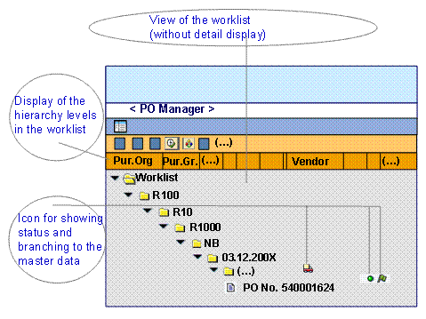
From the hierarchy tree, you can navigate to other views.
The following details the main functions:
¡ Start a default selection variant
By choosing  with the quick info text
Exect. Default
Selection Var., you can
execute a default selection variant. If none exists, a selection screen
appears as it does when you choose with the quick info text Call
Selection Tree. If selection variants exist, you can select one from a
dropdown list. You define the default selection variants on the selection
screen.
with the quick info text
Exect. Default
Selection Var., you can
execute a default selection variant. If none exists, a selection screen
appears as it does when you choose with the quick info text Call
Selection Tree. If selection variants exist, you can select one from a
dropdown list. You define the default selection variants on the selection
screen.
¡ Change the tree display
The system displays the fields in
a standard view, that you can change and save by choosing  with the
quick info text Settings for Tree. You can show and hide hierarchy
levels and columns and define their sequence. You can display descriptions
and/or IDs for the hierarchy levels.
with the
quick info text Settings for Tree. You can show and hide hierarchy
levels and columns and define their sequence. You can display descriptions
and/or IDs for the hierarchy levels.
¡ Update the worklist and the tree display
Depending on where you position
the cursor in the worklist, you can update the whole worklist (if you select
the root node) or just parts of it by choosing  with the
quick info text Refresh Subtree.
with the
quick info text Refresh Subtree.
¡ Branch to the application groups
You can call application groups in
the right-hand part of the screen for a worklist object in the tree (end
node). Double-clicking on an object calls the application group that is
assigned as standard. You can select other application groups, if they exist,
via the context menu or by choosing  with the quick info text Call
Application Group.
with the quick info text Call
Application Group.
An application group is made up of the corresponding detail views (called Application Function in the system). The application functions are implemented as ALV grid controls.
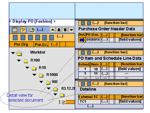
The application group Seasonal Procurement Purchase Order, for example, is made up of the following application functions:
§ Purchase Order Header Data
§ Purchase Order Item and Schedule Line Data
§ Dateline
4. Application groups (detail views)
When you call an application group, (if the worklist is open) the system opens several application functions below one another on the right-hand side of the screen as in the following graphic, for example:
Just as with the worklist view, you can also control the display of the detailed views using your own layouts, for example, you can show or hide individual views and change their sequence.
Instead of scroll bars, you use the following icons to navigate between the individual application functions:
 with the quick info text Scroll One
Application Function Up
with the quick info text Scroll One
Application Function Up
 with the quick info text First Application
Function
with the quick info text First Application
Function
 with the quick info text Last Application
Function
with the quick info text Last Application
Function
 with the quick info text Scroll One
Application Function Down
with the quick info text Scroll One
Application Function Down
In the
standard delivery, the detail views displayed are set up so that in the
application functions, the level of detail of the displayed data increases
from top to bottom and the data relates to the previous application function.
The system uses a blue arrow  , for
example, with the quick info text Selected for Display of Item Data, to
indicate the row to which the displayed dependent data relates. The default
setting is for the system to display the dependent data for the first row of a
preceding application function.
, for
example, with the quick info text Selected for Display of Item Data, to
indicate the row to which the displayed dependent data relates. The default
setting is for the system to display the dependent data for the first row of a
preceding application function.
Message display
After executing a check, the system displays any messages, as necessary. The user interface generally flags them with the following icons:
·
 with the quick info text
Display Log if there are information or warning messages.
with the quick info text
Display Log if there are information or warning messages.
·
 with the quick info text
Display Error Log if there are error messages.
with the quick info text
Display Error Log if there are error messages.
If the relevant information is available, the system supports context-sensitive jumps to the point in the application function to which the message refers. If you double-click a message in the application log, the cursor moves to the relevant cell in ALV grid control. The following options exist for the relevance of the message:
· Document number
The message concerns the whole document.
· Item number
The message concerns a document or order list item.
· Schedule line number
The message concerns a schedule line in a document item.
· Specific cell
The message concerns the site, for example.
Help concept
In addition to the normal Application
Help that can be called via the Help menu, there are also short
texts available in the application functions to provide you with extra
information about certain change options, for example, Purchase order header
data quick help. You can call these in the application functions in change
mode using the  pushbutton with the quick info text End
User Documentation and the dropdown menu Help for Application
Function.
pushbutton with the quick info text End
User Documentation and the dropdown menu Help for Application
Function.
Navigation concept
You can navigate through the workbenches or application groups using the following standard pushbuttons:
·
 with the quick info text
Back
with the quick info text
Back
Returns to the last application group called (including worklist); otherwise the system returns to the SAP Easy Access screen.
·
 with the quick info text
Exit
with the quick info text
Exit
Returns to the last application group called for the last workbench called.
·
 with the quick info text
Cancel
with the quick info text
Cancel
Returns to the SAP Easy Access screen.
For more
information about the standard processing options in the ALV grid control for
the application functions, see
 Input Readiness in the
SAP List Viewer.
Input Readiness in the
SAP List Viewer.