
 TriStateCheckBox Properties
Properties in the View Designer
· checked
Describes whether the UI element is selected.
This property can be personalized by an administrator.
Value |
Visual Display |
Description |
Can be set using personalization |
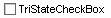
false |
|
Option is not selected and the graphic is displayed on the user interface without a checkmark. |
ja |
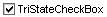
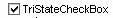
true |
|
Option is selected and the graphic is displayed on the user interface with a checkmark. |
Yes |
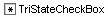
undecided |
|
Option is provided with a small star which indicates that you can decide to select the option or not. |
Yes |
· explanation
Help text
for an application that is displayed in activated help mode.
See also Explanation
· readOnly
Specifies whether the user can select the TriStateCheckBox or whether it only is to be displayed as read-only.
This
property can be personalized by an administrator.
This property can be assigned the value, true, through
personalization.
· state
Error status of the interface element
Value |
Visual Display |
Description |
normal |
|
Normal status of the interface element |
required |
|
The value must be entered |

· text
Label text that is displayed as explanatory text within the TriStateCheckBox.
· textDirection
Text or writing direction.
This enables labels of interface elements to be read in languages that have an RTL writing direction, such as Hebrew and Arabic, as opposed to LTR such as English.
Value |
Description |
INHERIT |
The text direction is inherited from the parent element. Therefore, the text direction is identical to the one of the parent element. |
LTR |
Left to right text direction |
RTL |
Right to left text direction |