
 Tray
Tray 
The Tray UI element (IWDTray) is a UI element container like the Group UI element container and can be used to group a set of UI elements under one common title. Unlike the Group UI element it provides additional functions. For example, the Tray UI element can be displayed or hidden.
Examples of the Display
|
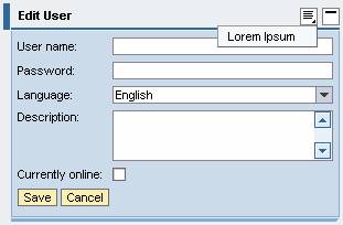
Tray with Design Plain
Tray with Design Fill and Menu
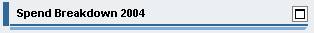
Collapsed Tray with Transparent Design
|


If the property caption has not been set, the property accessibilityDescription is checked during the design time to ensure Accessibility.
The property tooltip is not checked.
A tooltip does not necessarily have to be set for this UI element, but it could make sense to set it, if it contains detailed semantic information.
Runtime Class |
CL_WD_TRAY |
Properties in the View Designer
Name |
Type |
Initial Value |
Bindable |
ID |
STRING |
(automatic) |
No |
Text |
|
Yes |
|
STRING |
|
Yes |
|
WDUI_TRAY_DESIGN |
transparent |
Yes |
|
WDY_BOOLEAN |
true |
Yes |
|
WDY_BOOLEAN |
true |
Yes |
|
WDY_BOOLEAN |
true |
Yes |
|
STRING |
|
Yes |
|
WDUI_SCROLLING_MODE |
none |
Yes |
|
Text |
|
Yes |
|
WDUI_VISIBILITY |
visible |
Yes |
|
STRING |
|
Yes |
Aggregations in the View Designer
Name |
Cardinality |
Type |
0..n |
||
1..1 |
||
0..1 |
||
0..1 |
Events in the View Designer
Name |
Further properties that can be inherited are defined in the associated higher-level class. The associated interface elements are:
Dynamic Programming
For dynamic programming the same properties, events, and aggregations are provided in the View Designer. Bear in mind the different spellings.
Dynamic Programming of Properties
View Designer Name |
Runtime Name |
Type |
ACCESSIBILITY_DESCR |
WDY_MD_TRANSLATABLE_TEXT |
|
DEFAULT_BUTTON_ID |
STRING |
|
DESIGN |
WDUI_TRAY_DESIGN |
|
design: fill |
CL_WD_TRAY=>E_DESIGN-FILL |
|
design: plain |
CL_WD_TRAY=>E_DESIGN-PLAIN |
|
design: transparent |
CL_WD_TRAY=>E_DESIGN-TRANSPARENT |
|
ENABLED |
WDY_BOOLEAN |
|
EXPANDED |
WDY_BOOLEAN |
|
HAS_CONTENT_PADDING |
WDY_BOOLEAN |
|
HEIGHT |
STRING |
|
SCROLLING_MODE |
WDUI_SCROLLING_MODE |
|
scrollingMode: auto |
CL_WD_TRAY=>E_SCROLLING_MODE-AUTO |
|
scrollingMode: both |
CL_WD_TRAY=>E_SCROLLING_MODE-BOTH |
|
scrollingMode: none |
CL_WD_TRAY=>E_SCROLLING_MODE-NONE |
|
TOOLTIP |
WDY_MD_TRANSLATABLE_TEXT |
|
VISIBLE |
WDUI_VISIBILITY |
|
visible: none |
CL_WD_TRAY=>E_VISIBLE-NONE |
|
visible: visible |
CL_WD_TRAY=>E_VISIBLE-VISIBLE |
|
WIDTH |
STRING |
|
Dynamic Programming of Events
View Designer Name |
Runtime Name |
ON_TOGGLE |
Dynamic Programming of Aggregations
View Designer Name |
Runtime Name |
Cardinality |
CHILDREN |
0..n |
|
HEADER |
1..1 |
|
POPUP_MENU |
0..1 |
|
TOOLBAR |
0..1 |
Example
You can find examples of this interface element in the system in the Web Dynpro application WDR_TEST_UI_ELEMENTS, and in the component WDR_TEST_EVENTS in the view Tray.