
 ItemListBox
This UI element is similar to the classical GUI concept of a selection list with simple and multiple selection (list box). A list of text entries is displayed in a box of a fixed size, which if necessary you can scroll through. One or two columns are displayed for the values and possibly one column for symbols is displayed before the value column(s).
In the case of a simple selection the selected entry is determined by the lead selection of the dataSource. If the user changes the selection the property selectionChangeBehaviour is adhered to. With multiple selection the selected entries are determined by the dataSource selection only; selectionChangeBehaviour is not considered.

When the template is designed there is no check for the tool tip property to guarantee Accessibilty.
A tooltip does not necessarily have to be set for this UI element, but it could make sense to set it, if it contains detailed semantic information.
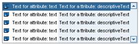
Example of the Display
|
|
Runtime Class |
CL_WD_ITEM_LIST_BOX |
Properties in the View Designer
Name |
Type |
Initial Value |
Bindable |
ID |
STRING |
(automatic) |
No |
context node |
|
mandatory |
|
Text |
|
Yes |
|
WDUI_TEXT_DIRECTION |
inherit |
Yes |
|
WDY_BOOLEAN |
true |
Yes |
|
Text |
|
No |
|
STRING |
|
Yes |
|
WDY_BOOLEAN |
false |
Yes |
|
WDY_BOOLEAN |
false |
Yes |
|
WDUI_LEAD_SEL_CHNG_BEHVR |
auto |
No |
|
Text |
|
Yes |
|
WDUI_TEXT_DIRECTION |
inherit |
Yes |
|
Text |
|
Yes |
|
WDUI_VISIBILITY |
visible |
Yes |
|
I |
10 |
Yes |
|
STRING |
|
Yes |
Further properties that can be inherited are defined in the associated higher-level class. The associated interface elements are:
Dynamic Programming
For dynamic programming the same properties, events, and aggregations are provided in the View Designer. Bear in mind the different spellings.
Dynamic Programming of Properties
View Designer Name |
Runtime Name |
Type |
DATA_SOURCE |
OBJECT |
|
DESCR_TEXT |
WDY_MD_TRANSLATABLE_TEXT |
|
DESCR_TEXT_DIRECTION |
WDUI_TEXT_DIRECTION |
|
descriptiveTextDirection: inherit |
CL_WD_ITEM_LIST_BOX=>E_DESCR_TEXT_DIRECTION-INHERIT |
|
descriptiveTextDirection: ltr |
CL_WD_ITEM_LIST_BOX=>E_DESCR_TEXT_DIRECTION-LTR |
|
descriptiveTextDirection: rtl |
CL_WD_ITEM_LIST_BOX=>E_DESCR_TEXT_DIRECTION-RTL |
|
ENABLED |
WDY_BOOLEAN |
|
EXPLANATION |
WDY_MD_TRANSLATABLE_TEXT |
|
ICON_SOURCE |
STRING |
|
MULTIPLE_SELECTION |
WDY_BOOLEAN |
|
READ_ONLY |
WDY_BOOLEAN |
|
SELECTION_CHANGE_BEHAVIOUR |
WDUI_LEAD_SEL_CHNG_BEHVR |
|
selectionChangeBehaviour: auto |
CL_WD_ITEM_LIST_BOX=>E_SELECTION_CHANGE_BEHAVIOUR-AUTO |
|
selectionChangeBehaviour: manual |
CL_WD_ITEM_LIST_BOX=>E_SELECTION_CHANGE_BEHAVIOUR-MANUAL |
|
TEXT |
WDY_MD_TRANSLATABLE_TEXT |
|
TEXT_DIRECTION |
WDUI_TEXT_DIRECTION |
|
textDirection: inherit |
CL_WD_ITEM_LIST_BOX=>E_TEXT_DIRECTION-INHERIT |
|
textDirection: ltr |
CL_WD_ITEM_LIST_BOX=>E_TEXT_DIRECTION-LTR |
|
textDirection: rtl |
CL_WD_ITEM_LIST_BOX=>E_TEXT_DIRECTION-RTL |
|
TOOLTIP |
WDY_MD_TRANSLATABLE_TEXT |
|
VISIBLE |
WDUI_VISIBILITY |
|
visible: none |
CL_WD_ITEM_LIST_BOX=>E_VISIBLE-NONE |
|
visible: visible |
CL_WD_ITEM_LIST_BOX=>E_VISIBLE-VISIBLE |
|
VISIBLE_ITEMS |
I |
|
WIDTH |
STRING |
|
Example
You can find examples in the system in the Web Dynpro application, WDR_TEST_UI_ELEMENTS.