
 TriStateCheckBox Properties

Properties in the View Designer
● activateAccessKey
Activation of access keys.
This property can be personalized both by a user and by an administrator.
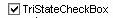
● checked
Describes whether the UI element is selected.

Use the type WDUI_TRI_STATE as the context attribute type.
You can also predefine values; see Methods and Properties of UI Elements.
Value |
Visual Display |
Description |
Can be set using personalization |
false |
|
Option is not selected and the graphic is displayed on the user interface without a checkmark. |
Yes |
true |
|
Option is selected and the graphic is displayed on the user interface with a checkmark. |
Yes |
undecided |
|
Option is provided with a small star which indicates that you can decide to select the option or not. |
Yes |

● explanation
Help text
that is displayed when the help mode is activated.
See Help Texts for Web
Dynpro Applications
This property can be personalized by an administrator.
● readOnly
Specifies whether the user can select the TriStateCheckBox or whether it only is to be displayed as read-only.
This property
can be personalized by an administrator.
In personalization, this property
can be assigned the value true
● state
Error status of the interface element
Value |
Visual Display |
Description |
normal |
|
Normal status of the interface element |
required |
|
The value must be entered |

● Text
Label text that is displayed as explanatory text within the TriStateCheckBox.
This property can be personalized by an administrator.
● textDirection
Text or writing direction.
This enables labels of interface elements to be read in languages that have an RTL writing direction, such as Arabic or Hebrew, as opposed to LTR for languages like English.
This property can be personalized by an administrator.
Value |
Description |
INHERIT |
The text direction is inherited from the parent element. Therefore, the text direction is identical to that of the parent element. |
LTR |
Left to right text direction |
RTL |
Right to left text direction |