
 CheckBoxGroup Properties

Properties in View Designer
● accessibilityDescription
Once you have activated accessibility, the assigned text is added to the quick info. This description provides semantic details of the UI element and is only read by the screen reader if the user focuses the complete Ul element.
This property can be personalized by an administrator.
● activateAccessKey
Activation of access keys.
This property can be personalized both by a user and by an administrator.
● colCount
Specifies the number of columns in which the CheckBox elements are grouped.
This property can be personalized by an administrator.
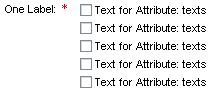
● readOnly
Specifies whether the user can select the checkboxes in the CheckBoxGroup or whether it is to be displayed as read-only.
This property
can be personalized by an administrator.
In personalization, this property
can be assigned the value 'true'.
● state
Error status of the interface element.
This property can be personalized by an administrator.
Value |
Visual Display |
Description |
Can be set using personalization |
normal |
|
Normal status of the interface element |
No |
required |
|
The value
must be entered. |
Yes |
● textDirection
Text or writing direction.
This enables labels of interface elements to be read in languages that have an RTL writing direction, such as Arabic or Hebrew, as opposed to LTR for languages like English.
This property can be personalized by an administrator.
Value |
Description |
Can be set using personalization |
inherit |
The text direction is inherited from the parent element. Therefore, the text direction is identical to that of the parent element. |
Yes |
ltr |
Left to right text direction |
Yes |
rtl |
Right to left text direction |
Yes |
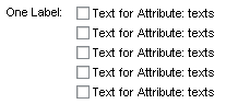
● texts
Specifies the path of the context attribute within a context node whose node elements provide the texts of the individual checkboxes at runtime.
If you only want to select individual CheckBox entries, you require a node with the node attributes 'enabled' (of type WDY_BOOLEAN) and 'texts' in the context. You can then deactivate individual CheckBoxes by binding 'enabled' on the same node as 'texts'.
● width
Width of the UI element. See also Methods and Properties of UI Elements.
This property can be personalized by an administrator.